
Published on May 6, 2021 Reading time: 26 min

Three patterns for accessible navigation menus

Post category: Accessibility
Accessible navigation menus

Navigation menus are one of the most common components in digital media.

In principle, it is a list of links that, on one hand,  allows the user to navigate between the pages of the site or application and, on the other, provides them with an overview of the structure and content they can discover. However, when navigation menus contain more than one level (i.e., submenus), it takes more than a list of valid links wrapped in a <nav> tag for the component to be accessible to the user.

Since this is such a common and essential component, we could expect at least agreement in principle on the features required for its accessibility. Nevertheless, navigation menus have managed to provoke controversy and emotion when it comes to accessibility. In this post, we will look at three patterns or approaches to building accessible navigation menus.

The first pattern is the WAI-ARIA Authoring Practices’ “Navigation Menubar“, which has been criticized by some accessibility specialists and users who have even demanded adding clarifications regarding its semantic structure and usage by end-users. Next, we will look at the “Link + Disclosure Widget Navigation” by Adrian Roselli. Roselli is one of the prominent voices in the critique of the “Navigation Menubar” pattern. He introduced his pattern in response to his unheard arguments against it. We will look at the differences between the patterns and explain Roselli’s point of view, relying on his blog post “Don’t Use ARIA Menu Roles for Site Nav“. Finally, we will overview a pattern by Sarah Higley named “Disclosure for Navigation Menus“, which was also created as an alternative for the “Navigation Menubar” pattern and was later accepted by the APG as another pattern for navigation menus.

We will analyze each of the patterns from the following perspectives: 

  • The HTML structure, and in particular its semantics and required ARIA attributes
  • Keyboard support and focus management

We will examine the patterns while looking at a simple navigation menu of a made-up department store that contains three items at the first level, with two of them having submenus that make up a second level. The component looks something like this, with the top items styled in a horizontal row and a second level expanded vertically on interaction:
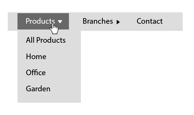
Navigation menu with three items. A mouse pointer is hovering the first menu item and expanding its submenu.

Let’s start by examining the “Navigation Menubar” pattern from the WAI-ARIA Authoring Practices.

Navigation menubar

Semantics And HTML Structure of the “Navigation Menubar” pattern

We will start by looking at the pattern’s HTML structure. It looks something like this:

<nav aria-label="Department Store">
  <ul id="menubar" role="menubar" aria-label="Department Store">
    <li role="none">
      <a role="menuitem" 
         aria-expanded="false"
         aria-haspopup="true" 
         href="#" 
         tabindex="0">
        Products
      </a>
      <ul role="menu" aria-label="Products">
       <li role="none">
          <a role="menuitem" href="/path-to/products" tabindex="-1">
            All Products
          </a>
        </li> 
       <li role="none">
          <a role="menuitem" 
             href="/path-to/products/office" 
             tabindex="-1">
            Office
          </a>
        </li>
        <li role="none">
          <a role="menuitem" 
             href="/path-to/products/home" 
             tabindex="-1">
            Home
          </a>
        </li>
        <li role="none">
          <a role="menuitem" 
             href="/path-to/products/home" 
             tabindex="-1">
            Garden
          </a>
        </li>
      </ul>
    </li>
    <li role="none">
      <a role="menuitem" 
         aria-haspopup="true" 
         aria-expanded="false" 
         href="#" 
         tabindex="-1">
        Branches
      </a>
      <ul role="menu" aria-label="Blog">
        <li role="none">
          <a role="menuitem" 
             href="/path-to/branches/branch-1" 
             tabindex="-1">
            Branch 1
          </a>
        </li>
        <li role="none">
          <a role="menuitem" 
             href="/path-to/branches/branch-2" 
             tabindex="-1">
            Branch 2
          </a>
        </li>
      </ul>
    </li>
    <li role="none">
      <a role="menuitem" 
         href="/path-to/contact" 
         tabindex="-1">
        Contact
      </a>
    </li>
  </ul>
</nav>

All three patterns at the component’s top-level have one thing in common, namely a <nav /> element so that assistive technologies can announce and treat it as a “navigation” element.Next, we have an unordered list element with a role=”menubar” attribute and an aria-label to identify this particular navigation area:

<ul id="menubar" role="menubar" aria-label="Department Store">
  <!-- Menu bar content -->
</ul> 

Using role="menubar" may seem natural and obvious as we tend to refer to navigation menus as “menu bar” because of their appearance and layout; however, the group of “menu” roles that includes the “menubar“, “menu“, “menuitem“, “menuitemcheckbox”, and “menuitemradio” roles should represent a specific type of menu. Let’s look at the definition of the “menubar” role to clarify what it means:

“The menubar role is used to create a menu bar similar to those found in Windows, Mac, and Gnome desktop applications.“

We notice a similar requirement on the “menu” role definition:

“The menu role is appropriate when a list of menu items is presented in a manner similar to the menu on a desktop application.“

On the semantic level the “menu” and ״menubar״ roles should reflect a menu similar to that of desktop applications. This may seem like an insignificant detail, but it is the basis of criticism that Roselli and other accessibility experts have on the pattern. We will touch on this in detail in the next section, where we examine Roselli’s pattern.

On the next level, we have the list items (<li>), which has a role="none" attribute. Why is that? Well, this is due to the use of the “menu” and “menubar” roles. Let’s go back to the WAI-ARIA specifications. We can see that both “menu” and “menubar” roles require a “menuitem” or one of its derivatives (“menuitemcheckbox“, “menuitemradio“) as direct children to support the menu structure (“menubar” can also have a role=“menu” as a direct child). Since the link or button within the list item is in fact the actual menu item, we need a way to make the accessibility APIs ignore the <li>. We do this by adding them a role="none".

Now let’s look at the menu items. There are two types of menu items in this pattern. The first one triggers the appearance of a popup menu, and the second is the actual navigation link. Let’s start by examining at the first type:

  <ul id="menubar" role="menubar" aria-label="Department Store">
    <li role="none">
      <a role="menuitem" 
         aria-expanded="false"
         aria-haspopup="true" 
         href="#" 
         tabindex="0">
        Products
      </a>
      <ul role="menu" aria-label="Products">
	    <!-- Submenu Content -->
      </ul>
    </li>
    <li role="none">
      <a role="menuitem" 
         aria-haspopup="true" 
         aria-expanded="false" 
         href="#" 
         tabindex="-1">
        Branches
      </a>
      <ul role="menu" aria-label="Blog">
        <!-- Submenu Content -->
      </ul>
    </li>
    <li role="none">
      <a role="menuitem" 
         href="/path-to/contact" 
         tabindex="-1">
        Contact
      </a>
    </li>
  </ul>

In this example, the <a> elements that trigger popup menus have a sibling <ul role=" menu">, which is the popup menu itself. We will get to that later, but let’s start with the anchor element’s attributes first. 

As mentioned above, the anchor element has a role="menuitem" attribute as required from a direct child of “menu” and “menubar” elements. In addition to the “role” attribute, it has two attributes indicating that it triggers the appearance of a submenu. The first one is the “aria-expanded” attribute, which is more of a state indication. As the name implies, its role is to indicate to screen reader users whether the menu is expanded or collapsed, and therefore its value should change to “true” whenever the submenu is visible. 

The second one is the “aria-haspopup” attribute. This attribute is also directly related to the usage of “menu” roles since it must refer only to elements with one of the following roles: menu, listbox, tree, grid, or dialog. In this case we could use one of two values, namely “menu” or “true”, which defaults to “menu”. The aria-haspopup attribute’s value should match the role of the element it triggers its appearance (e.g., aria-haspopup="listbox"). However, in the example above, I used the value “true” since it is equivalent to the “menu” value.

In reference to the menu (<ul role="menu">) element, its “aria-label” attribute has a value that matches the text of its triggering button. This is done to help screen reader users associate the button and the menu it triggers. We could allegedly achieve that by using the “aria-controls” attribute. Still, since this attribute, like the “aria-haspopup“, is poorly supported, it is common to make this association by name.The rest of the structure is pretty straightforward; the leaf <a> elements have a “menuitem” role to support the menu structure, made possible with <li role="none">. Besides that, they act as standard links. We will refer to the “tabindex” attribute in the next section, where we will  discuss keyboard support.

Keyboard support and focus management for the “navigation menubar” pattern

It is likely to assume that switching between controls (e.g., links, buttons) within a “menubar” using the keyboard, would be done by pressing the Tab key as we would with intractable elements that are not part of a “menubar“. However, the “menu” and “menubar” semantics dictate specific and non-standard keyboard support.

Let’s look at the “menu” and “menubar” roles’ definitions and what they are saying regarding the keyboard support. 

Both definitions end with this sentence:

“To be keyboard accessible, authors SHOULD manage the focus of descendants for all instances of this role, as described in Managing Focus.“

This sentence teaches us that the responsibility for managing the focus within “menu” elements is on the developer, i.e., we cannot rely on tabbing and natural focus sequence. The sentence ends by referencing the “Managing Focus” section in the WAI-ARIA document for further elaboration. Jumping to the “Managing Focus” section we learn that, starting with the third paragraph and to the end of the section, there is a description of the expected focus management in “menu”, as well as a few other elements that rely on ARIA roles:

WAI-ARIA includes a number of “managing container” widgets, also known as “composite” widgets. When appropriate, the container is responsible for tracking the last descendant that was active.  […]

When the container or its active descendant has focus, the user may navigate through the container by pressing additional keys, such as the arrow keys, to change the currently active descendant. Any additional presses of the main navigation key (generally the TAB key) will move out of the container to the next widget.

The “menu” roles require non-standard keyboard support, i.e., disabling the DOM’s manual tabbing sequence, and managing focus by custom scripting. That brings us back to HTML and the tabindex="-1" of the anchor elements. The “-1” value disables the manual focus by tabbing,passing responsibility to the developer to set the focus programmatically. However, since the “menubar” should mime menu bars of desktop applications, it requires keyboard support for the arrow keys using the roving tabindex technique. Below are the complete tables for supported keyboard keys for “menubar” and “menu” elements:

KeyFunction
Space, EnterOpens submenu and moves focus to the first item in the submenu.
Right Arrow– Moves focus to the next item in the menubar.
– If focus is on the last item, it moves focus to the first item.
Left Arrow– Moves focus to the previous item in the menubar.
– If focus is on the first item, it moves the focus to the last item.
Down ArrowOpens submenu and moves focus to the first item in the submenu.
Up ArrowOpens submenu and moves focus to the last item in the submenu.
HomeMoves focus to the first item in the menubar.
EndMoves focus to the last item in the menubar.
Character– Moves focus to the next item in the menubar having a name that starts with the typed character.
– If none of the items have a name starting with the typed character, the focus does not move.
Keyboard support for the “menubar” element
KeyFunction
Space, EnterActivates menu item, causing the link to be activated.
Escape– Closes submenu.
– Moves focus to parent menubar item.
Right Arrow– If focus is on an item with a submenu, it opens the submenu and places focus on the first item.
– If focus is on an item that does not have a submenu:
1. Closes its parent submenu.
2. Moves focus to the next item in the menubar.
3. Opens submenu of newly focused menubar item, keeping focus on that parent menubar item.
Left Arrow– Closes submenu and moves focus to the parent menu item.
– If parent menu item is in the menubar, also:
1. moves focus to the previous item in the menubar.
2. opens submenu of newly focused menubar item, keeping focus on that parent menubar item.
Down Arrow– Moves focus to the next item in the submenu.
– If focus is on the last item, moves focus to the first item.
Up Arrow– Moves focus to the previous item in the submenu.
– If focus is on the first item, it moves the focus to the last item.
HomeMoves focus to the first item in the submenu.
EndMoves focus to the last item in the submenu.
Character– Moves focus to the next item having a name that starts with the typed character.
– If none of the items have a name starting with the typed character, the focus does not move.
Keyboard support for the “menu” element (the submenus)

(Taken from the Navigation Menubar Example page)

We can conclude by saying that the “Navigation Menubar” pattern is somewhat complicated. Its complexity stems mainly from the choice to use the “menu” roles’ semantics, which is particularly opinionated both in the HTML level and in terms of the programmatic intervention in focus management it requires. Whether this opinion contributes to or harms the user experience and accessibility as stated, is in dispute. To understand the opponents of using “menu” roles, let’s move on to examine Roselli’s “Link + Disclosure Widget Navigation” pattern and his claims about the issues in the “Navigation Menubar” pattern.

Link + disclosure widget navigation

In October 2017, Adrian Roselli published a post in his blog titled “Don’t Use ARIA Menu Roles for Site Nav“. He published this after he filed an issue against the ARIA Practices document earlier that year, demanding to add clarifications to the “Navigation Menubar” pattern regarding the meaning of “menu” semantics in a context of navigation components, which was rejected. However, only a year and a half later, Roselli published his own proposal for a navigation component in a blog post that carries the pattern’s name. Although Roselli is by no means the only critic of the “Navigation Menubar”, the amount of material he has published on the subject provides us with a holistic perspective on his perceptions.

Before we jump in to look at Roseli’s pattern, I want to draw your attention to the one significant difference. Here the items on the first level of the menu are links. Next to it, standing separately, is the icon button that is responsible for toggling the submenu if it exists. I’ll refer to this choice in some more detail towards the end of this post.
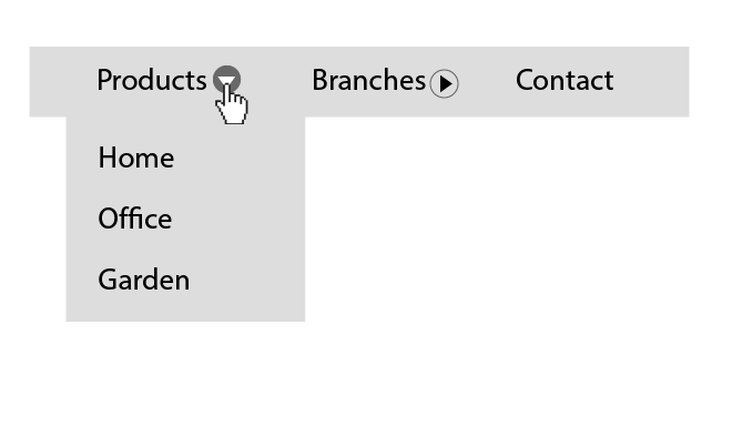
Navigation menu with three items. A mouse pointer is hovering the disclosure button of the first menu item and expanding its submenu.

Semantics and HTML structure of the link + disclosure widget pattern

The HTML structure of Roselli’s pattern looks like this:

<nav id="Nav">
    <ul>
        <li>
            <a href="/path-to/products"
               id="item01" 
               aria-current="page"> 
                Products 
            </a>
            <button type="button" 
                    id="btnItem01" 
                    aria-controls="subItem01" 
                    aria-expanded="false" 
                    aria-label="Show" 
                    aria-labelledby="btnItem01 item01"
                    onclick="toggleSubNav(this.id);">
                <svg xmlns="http://www.w3.org/2000/svg&quot;"
                     viewBox="0 0 80 80" 
                         focusable="false">
                     <path d="M70.3 13.8L40 66.3 9.7 13.8z"></path>
                 </svg>
            </button>
            <ul id="subItem01" 
                style="display:none;">
                <li>
                    <a href="/path-to/products/office">Office</a>
                </li>
                <li>
                    <a href="/path-to/products/home">Home</a>
                </li>
                <li>
                    <a href="/path-to/products/garden">Garden</a>
                </li>
            </ul>
        </li>		  
        <li>
            <a href="/path-to/branches" id="item02">Branches</a>
            <button type="button" 
                    id="btnItem02" 
                    aria-controls="subItem02" 
                    aria-expanded="false" 
                    aria-label="Show" 
                    aria-labelledby="btnItem02 item02"
                    onclick="toggleSubNav(this.id);">
                <svg xmlns="http://www.w3.org/2000/svg&quot;" 
                     viewBox="0 0 80 80" 
                     focusable="false">
                    <path d="M70.3 13.8L40 66.3 9.7 13.8z"></path>
                </svg>
            </button>
            <ul id="subItem02" style="display:none;">
                <li>
                    <a href="/path-to/branches/branch-1">Branch 1</a>
                </li>
                <li>
                    <a href="/path-to/branches/branch-2">Branch 2</a>
                </li>
            </ul>
        </li>
        <li>
            <a href="/path-to/contact" id="item03">Contact</a>
        </li>
    </ul>
</nav>

Looking at Roselli’s pattern, you can see that, in terms of the basic HTML structure, it is very similar to the ״Navigation Menubar” pattern. A <nav> element wraps the entire component, and the nested unordered lists of links represent each component’s levels. However, while the basic structure is somewhat similar, the semantics are entirely different. As briefly mentioned earlier, Roselli’s critique of the “Navigation Menubar” pattern was around the use of “menu” roles that he claims not only do not contribute to the accessibility of the component, but can even harm it.

In terms of the semantics, he claims (and we saw this in the “menubar” role definition at the top) that the semantics of the  menu roles match menus of complex web apps like Google Docs, for example, but are less suited to represent site navigation.

Roselli argues that, not only is this complexity unnecessary, it is also dangerous. As we saw earlier in the context of the “Navigation Menubar”,  the “menu” roles require a concrete HTML structure and attributes. While browsers are relatively tolerant of the HTML structure’s validity, assistive technologies, such as screen readers, will fail to mediate the UI to the user accurately, or at all, if, for example, a “role” or other ARIA attribute is applied to the wrong element. By waiving the use of ״menu״ roles, we reduce the risk of incorrect use of ARIA attributes, making the UI unusable to the very users we are trying to support. Let’s see how this is reflected in the HTML code.
The first difference is that now the top-level <ul> element doesn’t have the role="menubar" attribute. Let’s now look at its list items and their content.

<li>
    <a href="/path-to/products"
       id="item01" 
       aria-current="page"> 
        Products 
    </a>
    <button type="button" 
            id="btnItem01" 
            aria-controls="SubItem01" 
            aria-expanded="false" 
            aria-label="Show" 
            aria-labelledby="btnItem01 item01"
            onclick="toggleSubNav(this.id);">
        <svg xmlns="http://www.w3.org/2000/svg&quot;"
             viewBox="0 0 80 80" 
             focusable="false">
            <path d="M70.3 13.8L40 66.3 9.7 13.8z"></path>
        </svg>
    </button>
    <ul id="SubItem01" 
        style="display:none;">
        <!-- Submenu Content -->
    </ul>
</li>	

At the next level, the <li> elements now do not require a role="none" attribute, since they are no longer bound to the structural constraints of the “menu” roles. Respectively, the role="menu" and role="menuitem" are no longer required for the submenus (i.e., the nesting <ul> elements) and the anchor tags.

Before looking into the rest of the attributes, note that Roselli’s pattern is significantly different from the “Navigation Menubar” pattern in the HTML structure of the top-level controls of the component (i.e., the submenus’ toggle buttons). As opposed to the structure of “Navigation MenuBar”, Roselli separates the top-level nav elements to a link and a submenu toggle button (i.e., the disclosure widget in the pattern’s name). This structure will not work well in the context of the “menu” role. Remember, the “menu” roles require a strict semantic structure: the children of “menu” and “menubar” are constrained to be either “menu” or “menuitem” elements. So in this structure, both the link and the “disclosure widget” (activated via a toggle button) would need role="menuitem" to satisfy the structural requirements for role="menu". The duplication of menu items with somewhat similar names, which serve different purposes of the same subject, can produce a confusing user experience, mainly for screen reader users.

We will discuss this choice of structure and its meaning in more detail in the last section of this post.
Now, on each nav item with a submenu, there are two elements: the link and the button responsible for toggling the submenu. Let’s see which attributes each of them requires. We will start with the <a> elements.

<a href="/path-to/products" id="item01" aria-current="page"> 
    Products 
</a>

One attribute on the <a> elements of Roselli’s pattern that’s worth looking at, is the  “aria-current“. This state attribute indicates when an element within a set of related elements is the current item in the set. Note that “aria-current” has a specific list of allowed values. If it is assigned with a value outside this list, it will fall back to “true“, and screen readers will read it as “current item“. If it is assigned with an empty string, “false” or “undefined”, screen readers will ignore it. In the context of a navigation component as we have here, it is appropriate to use the value “page“. 

Now let’s look at the <button> toggle element, i.e., the disclosure widget, which has quite a few ARIA attributes. We will look at them one by one.

In the context of the “Navigation Menubar” pattern, we have discussed a technique to associate a menu button with the menu it triggers. It is done by using a similar name for the control and the menu element so that the user can logically associate them with each other. Roselli chooses a different approach and uses the “aria-controls” attribute, which is assigned with the id attribute of the controlled element. However, while this is allegedly a perfectly valid approach, it has one significant flaw, and that is that there is only one screen reader that supports the “aria-controls” attribute, JAWS, which, according to WebAIM’s latest Screen Reader User Survey, covers approximately 40.1% of the users. Therefore, most users will not benefit from it at all.

Moving forward, we can find the “aria-expanded” attribute, which we’ve discussed in the context of the “Navigation Menubar” pattern. Note that Roselli is not using “aria-haspopup“, since it is reserved for composite roles such as “menu” and “listbox“.

The last thing that I would like to discuss regarding this button is its naming method. Since it does not contain any text node to provide it with an accessible name, Roselli uses the “aria-label” and “aria-labelledby” attributes. Why does the button require both? Moreover, we can see that one of the ids assigned to the “aria-labelledby” attribute is the button’s id; hence it’s labeling itself. So how does it work? The “aria-labelledby” can combine an accessible name from a few different sources, so, for example, a screen reader will read the button on the component’s first item by default as “Show Products“. However, the value of the button’s “aria-label“, in this case, is being updated from “Show” to “Hide” and vice versa via Javascript whenever the submenu’s state changes, so when the submenu is expanded, a screen reader will read the button’s name as “Hide Products“.
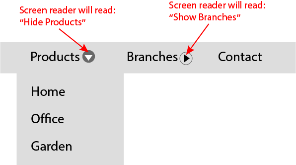
Navigation menu with three items. Tow of the menu items has buttons A mouse pointer is hovering the button of the first menu item and expanding its submenu. The second submenu is collapsed. An arrow pointing on the first button has a title: "Screen readers will read: Hide products". Another arrow is pointing the second button with a title: "Screen readers will read: Show branches".

After we reviewed the semantics and structure of Roselli’s pattern, let’s now look at its keyboard support requirements.

Keyboard Support And Focus Management for the Link + Disclosure Widget Pattern

Keyboard support for this pattern is pretty straightforward. First, note that the controls here do not have a tabindex="-1". In the “Navigation Menubar” pattern, we need them to manage the focus programmatically due to the requirements of the “menu” roles. In contrast to the “Navigation Menubar” pattern, Roselli’s pattern does not require programmatic focus management. In terms of focus management, this pattern solely relies on the DOM’s default focus sequence, so we should make sure that all the controls can be focused by manual tabbing and that nothing blocks it (like tabindex="-1", for example).The only key that Roselli specifically adds support to is the “Escape” key. Pressing it collapses any expanded submenu.

KeyFunction
EscapeCloses submenu

To summarize this section, we have seen how the semantic definitions affect the structure of the component, its requirements, and constraints, and directly affect how the end-user will use the component and the user experience. We could also learn that, even among the accessibility specialists, there is no agreement on the ideal navigation menu in terms of accessibility. What’s more, if you read Roselli’s post, you will see that the subject even elicits honest, emotional reactions.

In this spirit, we will move on to discuss the third and final pattern in this post. We will, however, not review it as thoroughly as the previous patterns discussed, but I bring it here because I believe that it, to some extent, combines some of the better features from each of the patterns we have reviewed so far.

Disclosure for navigation menus

I will start this section by saying that Sarah Higley’s “Disclosure for a Navigation Menu” pattern does not present a fundamentally different approach from those of the previous patterns we reviewed, particularly from Roselli’s patterns and, to some extent, also from the “Navigation Menubar” pattern. Nevertheless, I choose to refer to it since it seems that there is some consensus regarding it. In a way, it is the middle ground between the two other patterns we have reviewed earlier.

Semantics and HTML structure of the disclosure for a navigation menu pattern

In terms of semantics, Higley also avoids using the “menu” roles. Therefore, like in Roselli’s pattern, we are exempt from the constraints they present. However, in terms of the HTML, Higley’s pattern looks like a combination of the “Navigation Menubar” and the  “Link + Disclosure Widget Navigation” patterns. Let’s look at the HTML.

<nav aria-label="Department Store">
    <ul class="disclosure-nav">
        <li>
            <button aria-expanded="false" 
                    aria-controls="id_products_menu">
                Products
            </button>
            <ul id="id_products_menu">
                <li>
                    <a href="/path-to/products/">All Products</a>
                </li>
                <li>
                    <a href="/path-to/products/office">Office</a>
                </li>
                <li>
                    <a href="/path-to/products/home">Home</a>
                </li>
                <li>
                    <a href="/path-to/products/garden">Garden</a>
                </li>
            </ul>
        </li>
        <li>
            <button aria-expanded="false" 
                    aria-controls="id_branches_menu">
                Branches
            </button>
            <ul id="id_branches_menu">
                <li>
                    <a href="/path-to/branches/">All Branches</a>
                </li>
                <li>
                    <a href="/path-to/branches/branch-1">Branch 1</a>
                </li>
                <li>
                    <a href="/path-to/branches/branch-2">Branch 2</a>
                </li>
            </ul>
        </li>
        <li>
            <a href="/path-to/contact" id="Item03">Contact</a>
        </li>
    </ul>
</nav>

As you can notice, Higley also uses an <button> element for the disclosure widget; however, the user experience is somewhat different. In Higley’s pattern, the disclosure button is not sharing its space with an <a> element, so the whole navigation item serves a single purpose. On this subject, I believe that, though it depends on the use case, the user experience from the structure that Higley presents is better and more inclusive. If product constraints allow it, I believe it will be the better approach.

In terms of ARIA attributes, the button, in this case, contains a text node that makes its “accessible name” and spares us from using the “aria-label” and “aria-labelledby” attributes.

One thing that, in my opinion, was missing in Higley’s pattern was that she gave up the “aria-current” attribute to provide screen reader users with a better orientation in the website or application. However, this shouldn’t prevent you from using it if you are implementing the pattern by yourself. In this, we also summarize the section that deals with semantics and structure. Now let’s look at the pattern keyboard support.

Keyboard support and focus management for the disclosure for a navigation menu pattern

The essential requirements for keyboard support in Higley’s pattern are the same as in Roselli’s pattern. However, Higley accepted the suggestion on her pull request to add support for arrow keys as well. However, since in her pattern, the semantics do not force the support for these keys, Higley left this alternative optional.

Summary

First of all, I would like to thank you for getting this far. To sum it up, in this post we have reviewed three navigation components built with an accessibility orientation. We’ve addressed the components that we had to take into account in each pattern to support their accessibility. We have seen that the semantics we choose to use may dictate a specific structure and behavior, and presented approaches from several leading accessibility experts. 

I hope this post will help you choose the best and most accessible way to build your following navigation components.

Thanks for reading.

Acknowledgments

Thanks to Marcy Sutton for reviewing this post and sharing her insights.

Sources

WAI-ARIA Practices – Navigation Menubar Example

WAI-ARIA Practices – Example Disclosure for Navigation Menus

Adrian Roselli – Don’t Use ARIA Menu Roles for Site Nav

Adrian Roselli – Link + Disclosure Widget Navigation

Published on February 3, 2021 Reading time: 4 min

A new approach to accessibility at Capital One… with Evinced

Post category: Accessibility
Capital One's new approach to accessibility

Background

Capital One has made digital accessibility a priority for many years. Over time, we’ve invested in developing an industry-leading accessibility program to stay at the forefront of delivering best-in-class experiences to our existing and prospective customers. A key imperative has always been continuously advancing our goal of integrating accessibility into every aspect of our software development lifecycle.

Accessibility at Capital One is evaluated end-to-end during product ideation, design, and development, through automated and manual testing, and ongoing monitoring of our production environment. Ensuring all of our web and mobile assets are accessible and usable by all is a commitment across our organization and executive leadership, who are fully committed to this effort.

Problem

Compared to other areas of modern cloud infrastructure, such as cloud management, security, application development and data management, accessibility testing is too often an afterthought and left behind when it comes to cutting edge innovation. Most automated testing solutions use static, syntax analysis which provides adequate coverage in a world of static web properties. Today’s modern web and mobile content, however, leverage more dynamic, JavaScript heavy web applications which can leave existing testing solutions limited in monitoring accessibility/automated testing, often catching less than 10% of critical issues.

Most experts believe existing automated testing tools cover somewhere around 20-30% of Web Content Accessibility Guidelines (WCAG). With those solutions leaving so much more to address, a bulk of the heavy lifting for accessibility testing falls on someone (an accessibility team, if you’re lucky) to manually conduct.

As software release cycles become more frequent, manual review quickly struggles to scale and slows the overall release cycle. For example, during the implementation phase of a new feature, development teams previously interacted with Capital One’s Digital Accessibility Team (DAT) in a traditional consulting fashion. During the development phase, an accessibility subject matter expert worked with developers to make sure that the feature was accessible.

Although this process eventually resolved the outstanding issues, the back and forth, testing and retesting dialogue takes time. As release frequencies are increasing the DAT looked for solutions and technology to best ensure that Capital One’s products upheld the WCAG.

Solution

Evinced brings real innovation to this problem with a sophisticated technological approach, leveraging a combination of computer vision and machine learning models to detect a greater number of accessibility issues automatically. Capital One partnered with Evinced early, to guide their development with a particular focus on: helping developers release accessible code integrating multiple automated testing steps through the build and deployment lifecycle building products that can automatically scan for accessibility across a full web property (including through logins and internal repositories), and do this fast.

Our developers use the Evinced Dev Debugger to check their code for accessibility before a pull request. From there, some teams have begun using the Evinced Cypress Automation SDK to automatically test critical flows for accessibility in the CI flow.

When it comes to the DAT, we use the Evinced User Flow Analyzer to ensure COF products upheld the WCAG, and augment that with some manual testing. Finally, once code is pushed into production, the Evinced Site Scanner continuously monitors our production environment and reports our overall accessibility status, including new issues, old issues, MTTR of critical issues etc.

Results

We’ve seen Evinced discover as much as 10x more critical accessibility issues than we were previously finding through automated testing alone. An even greater number of issues are discovered when a site is more interactive, including  keyboard and screen reader usability issues (<keyboard accessible> and <interactable role>) Automated testing on a large enterprise scale can be an extremely complex and time consuming effort. Evinced is speedy and reliable, with 40x faster execution, enabling us to cut our processing time in some cases from 4-5 days down to less than 3 hours (and is being further optimized)

What’s next

Imagine a world where we already know what most of the issues are before developers submit their code for review. With the ability to automate testing of code repositories at scale, on demand, and before release we can create a snapshot at any given moment of the accessibility issues in dev and qa environments all over the company.

We will be able to leverage events (webhooks) from prominent code repositories to kick off scans with little input from the corresponding dev team. This will give us almost real time data as code flows from developers’ fingers all the way into production. Evinced is a great partner, delivering real innovation and helping us further integrate accessibility in our software development lifecycle.

Published on November 23, 2020 Reading time: 16 min

The treachery of HTML elements

Post category: Accessibility
A pink and white button that says "Click here" with a cursor on the right, above the words "ceci n'est pas une bouton" (this is not a button) with is a metaphor for html elements

In 1929, René Magritte, the surrealist painter who was only 30 years old at the time, painted one of his most famous paintings, named “The Treachery of Images”. The painting is of a brown wooden pipe with a dark spout, and the caption reads “Ceci n’est pas une pipe” (meaning This is not a pipe in French).

René Magritte – The Treachery of Images (This is Not a Pipe), 1929, used in this blog post as a metaphor for html elements.

The inherent contradiction of the image in the painting, its defiant caption, as well as the ideas the artist wished to convey have since been the subject of countless studies and art history books. The prevailing interpretation states that Magritte wished to emphasize the gap between language and reality by reminding the viewer that the object in front of him is not a pipe but only a visual representation of a pipe.In Harry Orciner’s book “Magritte: Ideas and Pictures” Magritte had this to say about the painting:

The famous pipe. How people reproached me for it! And yet, could you stuff my pipe? No, it’s just a representation, is it not? So if I had written on my picture “This is a pipe”, I’d have been lying!

René Magritte

I was recently reminded of Magritte’s painting when I saw a MEME where the caption “This is not a pipe” is replaced with, “B***h, I might be.” 

At the time, I was busy writing about how using semantic landmarks impacts the UX of screen reader and voice control software users.  I guess that’s why, when I saw this MEME, it crossed my mind that both the original painting and the MEME referencing it are framing the story of HTML semantics. The original picture illustrates the potential gaps between the semantics of the UI’s building blocks (the HTML elements), their visual output and their actual meaning in the UI, whereas the MEME boldly implies the options we have in HTML today to expand and, if necessary, also change the semantics of these building blocks.

Discussing the gap between visual representation and reality is an excellent intellectual exercise that has many variants. However, this gap may exclude users who do not have the ability and tools to bridge it when it comes to web pages and applications.

The aim of this post is to illustrate the importance of HTML semantics and its effect on how assistive technologies convey the UI with the help of Magritte’s painting.

One more side note before we dive into it: Almost all assistive technologies are affected by HTML semantics to some extent. In this post, I mainly refer to screen readers for two intertwined reasons.

Firstly, I am convinced that it is the assistive technology most affected by the HTML semantics.  

Secondly, because screen readers are so affected by the DOM semantics, they best illustrate the accessibility issues that may occur by lack of or incorrect semantics. 

Nevertheless, the issues we will discuss are relevant to the UX of other assistive technologies as well.

HTML elements tangibility

We still refer to Magritte’s painting. If a blind person were standing in front of the painting, and we asked him to describe the object in front of him, without intermediaries’ help, he would presumably rely mainly on the sense of touch. He will probably be able to say that it is a painted canvas and estimate its dimensions. If he is familiar with the materials, he may also say that it is an oil painting. There may be other small details he could tell. Still, we can assume that a “pipe” will not be one of the nouns he will use in his description, since apart from the flat visual representation of a pipe on it, this object doesn’t have any properties of a pipe because it is simply not a pipe.

The same issue applies to HTML elements. HTML elements exist in a virtual space and are therefore intangible.

The physical properties that characterize elements in the real world are replaced in the virtual space by semantic values that define the object’s properties. The semantics of an HTML element is the sum of the properties and states that determine its essence, purpose, and the way it is used; in our case, the properties are explicitly and implicitly conveyed to the user by assistive technologies.

Semantics in action

Let’s take two buttons, for example. Both buttons have the same CSS rules applied, and both have the same “onclick” event listener attached. One of the buttons is implemented with a <button> tag, and the other one is implemented using a <div> tag. While the <button> based button will be accessible for all assistive technologies users, the <div> based button will be hard or impossible to use by the same users. Let’s examine a few examples of why:

Keyboard only users

<div> elements are not focusable by default and therefore they are excluded from the page’s tabbing sequence. HTML elements that are not part of the page’s tabbing sequence (not focusable), are not accessible to keyboard users.

Screen reader users 

Screen readers announce each element’s type and how to use it in case the element is interactable. <div> elements are generic containers; nothing about their semantics implies that the user can interact with them. A screen reader won’t announce its type or how to use it, and only read its text node

Voice control users

Voice control software displays the names of the interactable elements on the page to control them by voice. For example, saying “click send” will trigger a button labeled with the word “Send“. But <div> elements are not mapped as interactable elements, and will therefore not be displayed by the voice control interface to interact with.

We saw three examples of how the lack of semantics affects the accessibility of the element. Still, one could claim that all the issues discussed above can be overcome by adding a few more attributes to the element, which brings us to discuss the MEME image’s side of the story.

Beyond the boundaries of native HTML semantics

Unfortunately, it is not a rare thing to find UI elements with incorrect semantics. Years of lack of orderly HTML standardization, insufficient semantic variety, and the browsers’ tolerance regarding the way the HTML is structured, led to a situation that there is often an incompatibility in web pages between the semantics, its building blocks and their actual meaning and purpose. While these incompatibilities will usually be imperceptible to the average user, they significantly affect the user experience of those who depend on assistive technologies to the point that they may prevent these people from using the interface at all.

Since issues arising due to the semantic structure mainly affect accessibility, it was only natural that WAI (Web Accessibility Initiatives) were the ones who took on the task. In 2014 they introduced the role attribute, backed up by the “Roles Model” as part of the WAI-ARIA.

The “role” attribute was designed to extend the semantics of HTML elements and allow for more complex semantic structures than what can be achieved with standard native HTML. The “role” attribute, at least in my opinion, is indeed the most significant leap made in the maturation of the language semantics. It is safe to say that the “role” attribute is the most diverse and complex HTML attribute. It has 61 allowed values, divided into three categories; some act as components of composite UI widgets and require specific parent or child elements. However, this complexity and diversity also make the “role” attribute deceptive, and misuse can often cause deterioration in accessibility instead of improving it.

Know your role (attribute)

A playful remake of René Magritte's painting and popular meme, showing a pipe and "b***h I might be" underneath, as a metaphor for html elements.

As mentioned earlier, the “role” attribute might be deceptive, since it may imply that setting a role to an element will automatically apply all the role’s attributes to it. In fact, the element will not adopt any of the role’s attributes, nor will it detract any of its default native attributes. For example, <div role="button">Click Me</div> will not become focusable, and will still have most of the issues discussed regarding the <div> based button earlier.

To better understand how the role attribute works, let’s look at the “WAI-ARIA Authoring Practices“. The document’s preface listed the only two principles that WAI defines for correct and effective use of the ARIA attributes. The first one refers to the role attribute:

Principle 1: A role is a promise

It is essential to understand that the only change the role attribute makes is to change the type of element on the accessibility tree. The accessibility tree is parallel to the DOM tree; its function is to map the page elements for assistive technologies. When we set a role to an element, we change how it will be listed and announced by assistive technologies. Therefore, as authors, we make a promise that we have incorporated into the element all the other attributes expected from its new role.

Let’s look at this example <div role="button">Click Me</div> again. Assistive technologies will register and announce this element as a ”button”. You may remember that this was one of the accessibility issues of the <div> cased button we have discussed earlier in this post. However, this button will still not be accessible for keyboard users. It has other screen readers related issues as well. 

As mentioned above, <div> elements are not focusable by default, and therefore they are not accessible as controls for keyboard users. We can fix that issue by adding to the <div> element tabindex="0", which makes any DOM element focusable. That will cover all the issues discussed above. What if, for example, this button should be disabled in some cases? A simple “disabled” attribute that could work just fine for a <button> element will not work here since the “disabled” attribute is a DOM attribute. As far as the DOM is concerned, the element has not changed, and it is still a <div>; hence it does not have a disabled/enabled state at all. Therefore, if we want to disable our <div> based button, we would have to do the following:

  1. Remove any keyboard/mouse event listeners attached to the element.
  2. Remove the “tabindex” attribute, so that it is not focusable.
  3. Add aria-disabled="true" so that screen readers can announce its correct state.

And you will have to do vice versa when you wish to enable it again.

Therefore, in the HTML world, a painting can become a pipe. However, it is a bad idea and considered bad practice to change elements’ semantics when there is an equivalent native semantic element. It is harder to maintain over time (since you will have to manage all the attributes and states by yourself), and it makes aless readable.

Another factor that often leads to a misunderstanding of the role attribute is its large amount and variety of allowable values. This variety sometimes creates the impression that any string is a valid value, while not only is there a strict list of allowed values, many of them require a specific set of additional attributes and states to fulfill their roles’ promise.

The role attribute was created out of necessity to enhance HTML’s semantic diversity.  In fact, it is its one and only purpose. Using it correctly can significantly improve the UX for assistive technologies that use the accessibility tree to convey content to the user. In the next and last part of this post, we will see how to safely use the role attribute and make sure that its promise is fulfilled.

Rules of thumb for using the role attribute

Always prefer a native semantic element over a role attribute

As mentioned earlier, the role attribute was meant to enhance the HTML semantics; it should by no means change or replace it. Role values with a native semantic equivalent were usually meant to be used in composite design patterns such as combo-boxes or multi-level menus, not for changing the semantics of a specific single element. Let’s now discuss accessible how to use to make the most out of the role attribute.

Be sure to use a valid role value

HTML element’s “role” attribute can be assigned with one of 61 different optional values; with that amount, one can easily make a mistake like using an inaccurate value string or an invalid value. To ensure that you are using a valid role value, check if the role value you wish to use is listed in the WAI-ARIA’s roles list.

Check the role’s required attributes, states, and context

As already mentioned, the semantics of an element is the sum of its properties and attributes. Setting a role to an element is similar to a statement of intent and promises that it can fulfill whatever is implied from its role. Certain roles should have a state or value available; others must be placed in a specific context or associated with other elements. In many cases, if these attributes are not set correctly or missing, the element will become less accessible than it was without having a role assigned to it.

Therefore, to ensure that we don’t miss any attribute, clicking the role name on the WAI-ARIA’s roles list will scroll the page to the role’s description and characteristics table. 

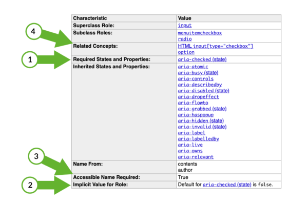
Let’s look at some of the “checkbox” role’s characteristics:

The "checkbox" role's characteristics table
  1. Required States and Properties: The listed properties under this characteristic are not optional and required to satisfy the role’s semantics.
  2. Implicit Value for Role: This is a default value that is set to the element in case a required state or value was not set.
  3. Accessible Name Required: This characteristic is self-explanatory; nevertheless, it is essential for the user’s ability to perceive the UI correctly.
  4. Related concepts: Since the WAI-ARIA role was designed to enhance HTML semantics, many of its values are based on the semantics of native HTML elements. The “Related concepts” characteristic presents the HTML element that the role is based on or most similar to if such an element exists. The roles’ characteristics tables are focused on attributes that affect how an element is registered to the accessibility tree. Still, these do not necessarily cover all the accessibility aspects of the element. For example, in our case, the “checkbox” role is related to HTML, input[type= "checkbox"] element. We know that input elements must be focusable to be accessible by keyboard, so we can infer that our element should be focusable as well. 

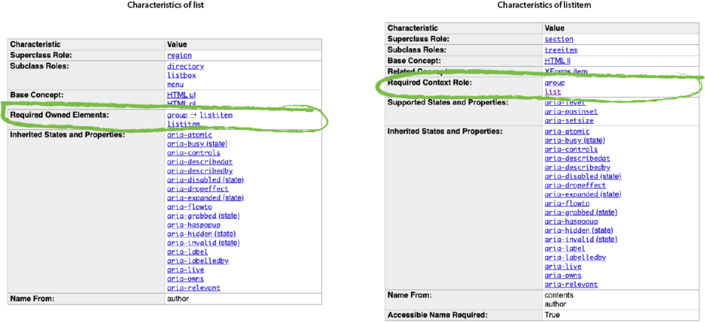
The characteristics rows of the characteristics table may vary between the different roles depending on the role’s semantic requirements. Let’s look at the characteristics tables of two more roles, namely “list“, and “listitem“. These roles, for example, have context requirements that the checkbox did not have. For example, the “list” role has a “Required Owned Elements” characteristic, which details what the type of its direct children must be. On the other hand, in the characteristics table of the “listitem” role, there is the opposite characteristic named “Required Context Role,” which specifies the required type of its parent element.

The "list" role's characteristics table with the "Required Owned Elements" row highlighted beside the The "listitem" role's characteristics table with the "Required Context Role" row highlighted

Checking the role’s characteristics table is therefore essential to ensure that we meet all the role’s requirements. However, some roles require a composite structure that involves more than one element, which does not necessarily have an explicit connection between them, and nevertheless, they may affect each other. In these cases, the characteristics tables are a good start, but they don’t give the full picture so we might want to check the WAI-ARIA’s Design Pattern Examples list.

ARIA Design Patterns 

The roles’ characteristics tables give us a restrained perspective of the states and properties required to the specific element with the “role” attribute. However, in most cases, an element with a role attribute will not stand by itself, and it will be part of a more complex structure. Let’s take a combo-box, for instance; it combines a drop-down list and a single-line editable text field, allowing the user to either type a value directly or select a value from the list. The element with the role="combobox" is only wrapping this orchestration and registering it to the accessibility tree as a “combobox”, but what does it take to make it accessible? We need a way to express whether the list is expanded or collapsed, announce what the currently active value is, whether there is auto-completion or not, which component in the widget controls which other components, and to generally convey the relationships between the different components of the widget.  

To assist developers in mapping all the accessibility requirements of the various roles, WAI-ARIA made a list of 44 roles and 32 attributes and created one or more code examples for each of them to illustrate different use cases of the role and its accessibility requirements.

The full list is part of the WAI-ARIA Authoring Practices. You can find it here.

One last side note before we are wrapping up. The role attribute, like the other WAI-ARIA attributes, constitutes significant progress towards an inclusive web. However, they are supported on a different level and manner between the various assistive technologies and browsers. So, if you intend to rely on an attribute which you are not sure how well it’s supported, it will be a good idea to check it to make sure and look for alternatives if needed.

Wrapping it up

At the beginning of the post, we explored the concept of semantics while looking at Rene Magritte’s painting, “The Treachery of Images“. We have come to see that the semantics of elements is essential for the accessibility of HTML pages and applications. We have also seen that the semantics of an element consist of attributes and behaviors, all of which need to be considered when the author defines the element’s semantics. Finally, we saw how the role attribute extends the native HTML semantics and ways how to use it correctly and effectively.

Thank you for reading.

Published on September 24, 2020 Reading time: 13 min

Meeting the WCAG Success Criterion Bypass Blocks (2.4.1)

Post category: Accessibility
"WCAG success criterion 2.4.1 bypass blocks" text on a blue background

This post is about meeting WCAG Success Criterion 2.4.1 Bypass Blocks. This criterion is required to complete accessibility conformance level A in order to improve the user experience for assistive technology users such as keyboard and screen reader users in navigating web pages and applications.

To better explain our solutions later on, let’s look at the problem first. The essential user experience of navigating web pages for users, which depends on the keyboard, is sequential on its basis. Web pages and applications often have blocks of content that repeats on more than one page. Take, for example, navigation bars, lists of social media links, and advertising frames, these can amount up to too many elements that the user has to pass one by one on every page.

The bypass blocks success criterion in its most puristic form is meant to solve this very problem. Let’s look at the exact wording of the success criterion: 

A mechanism is available to bypass blocks of content that are repeated on multiple Web pages.

WCAG 2.1. 2.4.1 Bypass Blocks

As you can see, the success criterion refers to a repeated blocks of content, but in my opinion the true essence of this success criterion is manifested in the description of its intent, which starts with these words:

The intent of this Success Criterion is to allow people who navigate sequentially through content more direct access to the primary content of the Web page.

Understanding Success Criterion 2.4.1: Bypass Blocks

A sighted user has the ability to ignore the repeated content by focusing the part of the page that interests him. Mouse users have the ability to interact with elements with a single mouse click rather than encountering every other element that comes before the item they are looking for.  

The bypass blocks success criterion gives keyboard users and screen reader users a satisfactory alternative for these capabilities.

In this post we will cover a few methods to use in order to meet the bypass blocks citerrion.

We will start by discussing skip-links, their role, and issues to look out for when using them. Lastly, we will see how to enable blocks’ bypassing by using semantic elements.

Skip-links

My relationship with web accessibility started a few years ago when I worked for a company that provided rich content widgets to large publishers. I was assigned to overview the products’ accessibility status and develop a plan for meeting the accessibility requirements of new regulations that just got in force. 

At that time, my understanding of web accessibility amounted to the requirement of an alt text to <img /> tags, so therefore I’ve started to research the subject. One of the first terms or ideas I ran into was the skip-links. The concept of providing an internal link that allows keyboard and screen reader users to skip right to the page content, made sense to me, and it helped me to see new aspects of page accessibility and the difficulties some users experience. 

Nevertheless, this is not another skip-links mechanism blog post. There are plenty of these already. This brings me to the second part of the story. A couple of years later, as part of my job for another company, I had to randomly test all sorts of websites and apps to find common accessibility issues. While doing these audits, I noticed that, although many of the websites had a skip-links mechanism, it was, in most cases, broken or only partially working. Looking further into it, I saw that the same issues with similar causes repeated themselves over and over again. So in this section, I would like to point out these common potential issues and suggest ways to avoid them as much as possible.

What are skip-links?

For a start, and just so we can ensure that we sync, and for the benefit of those who are less familiar with the concept, let’s start by defining what skip-links are.

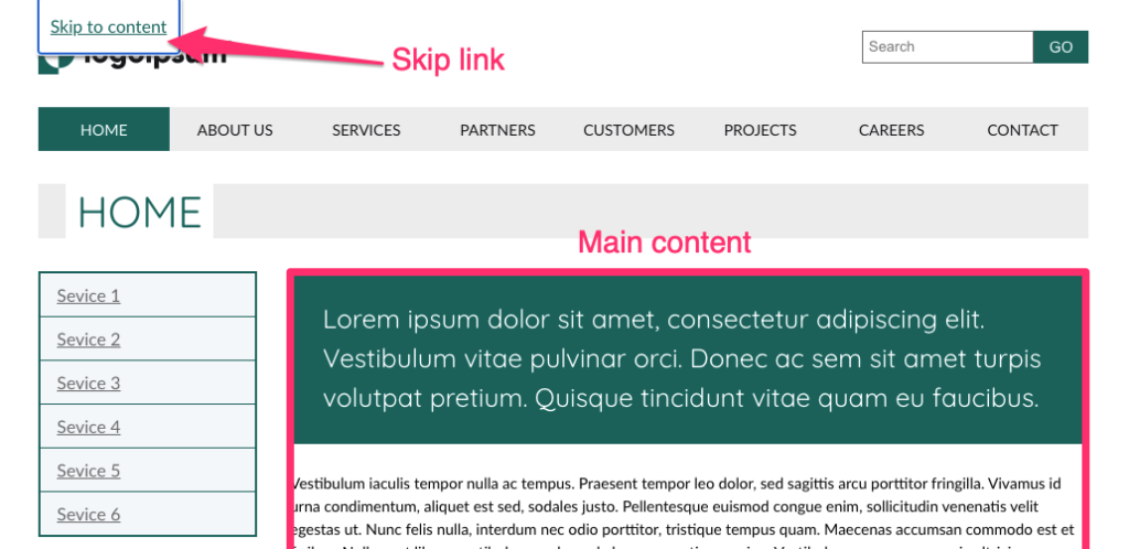
Skip-links is an internal link mechanism in web documents that allows users who depend on the keyboard to bypass UI parts that repeat on all the web pages. When clicking the skip-link(s), the linked element scrolls into view, and the user is spared the need to press the tab key repeatedly until the focus is set on the element they are looking for, and it is scrolled into the viewport.

A screenshot of a web page with a skip link
Try it yourself

See how skip-links work. Go to the page on the link above, press the Tab key and see the skip-link appearing (there are more than one). Now press the Enter key and see the main content scrolling to the top of the viewport. 

The dark side of skip-links

Skip-links is a pretty simple mechanism, and yet there are a few common pitfalls that can easily make it unusable to some or even all users. 

In this section I will share what I’ve learned about the common problems of skip-links and how you can try to avoid them whilst still making skip-links relevant to all users who need them.

Broken links

I want to start this section with a disclaimer. The causes of this issue that I will present here are mere assumptions. I have never talked to any of the teams or people who developed the sites and apps I tested to confirm these assumptions. I have based these assumptions on repetitive patterns in the HTML structure of the pages I tested and my own experience. That being said, let’s dive into it.

One of the most common issues that I’ve found was that skip-links are often simply broken; the anchor’s “href” attribute pointed to an “id” that did not exist on the page. I had also noticed that, in instances where there was more than one skip-link, they usually weren’t all broken, and there were cases where a skip-link worked on one page but not on the other. 

Based on this,  and assuming that the links tested did work, at least when they were first created, these links must have been broken in one of the following cases: 

  1. While updating or maintaining the page, a developer who was unaware of the skip-links, or inadvertently removed or changed the anchored “ID” attribute.
  2. When creating a new page, the skip-links were not taken into account, and the IDs that should have been linked to them were not added to the page.

Unfortunately, I don’t have a silver bullet to offer to prevent the skip-links from breaking altogether. However, I have found another pattern that  might be helpful in reducing the chances for it to happen. I have found that links that were anchored to layout elements such as <aside />, <footer />, and <main /> seemed to be more stable. I assume that, since they are usually defining the page’s layout, they are less likely to change. It may not seem like an incredibly innovative insight to you. Some will say, “Obviously, when updating pages, things can break, and it is the developer’s responsibility to do regression testing.” Nevertheless, I chose to present it because it raises two other issues for discussion. 

The first one is emphasizing the importance of awareness through all development teams of the system’s accessibility features so that they can, at least, take them into account. The other is the importance of semantic layout as a good practice in general, and the basis for implementing additional methods to bypass blocks that we will discuss in the following sections.

Skip-links and screen reader users 

The next skip-links issue that I would like to discuss, and which I saw repeating itself across many websites, is related to screen reader users. We already said that skip-links are linked to an element on the page by its ID, and clicking the skip-link should scroll this element to the top of the viewport. Simply linking to an anchor on the page will work correctly for keyboard users that are not dependent on screen readers, but that alone will not do the trick for screen readers. 

First, you have to know that screen readers distinguish between the system focus and their cursor (screen readers use various other names for this). On Apple’s VoiceOver it’s called the “VO cursor“, and NVDA calls it the “Navigator object“, for example. This distinction is made since the system focus can be set only on focusable elements. The screen reader cursor’s role is to set on and read non-focusable elements such as <p /> and <div />, allowing them to read their content to the user.

When we use an anchor link, the system focus moves along with it, so next time the user presses the Tab key, the focus will set on the next focusable element from the point the page has scrolled to. However, the screen reader cursor will only move to be set on the anchored element if it is focusable. When the anchored element is not focusable, the skip-link is still considered to be the “active element”, so the next element that the screen reader reads is the next one after the skip-link element on the DOM tree. 

The solution to this problem is straightforward – simply make the anchored element focusable. However, there are a couple of points to keep in mind, so this change will not affect other users’ user experience.

First, use tabindex="-1" to make the element focusable; this will exclude it from the “tab sequence”, so it will not affect keyboard users’ experience and still make the element focusable by linking to it.

The second point is about the rare times where the focus ring should not be visible. I have not seen a reference to it elsewhere, and it may be that I will provoke the wrath of some, but in my opinion, this is a case where hiding the focus indicator provides a better user experience. Let’s think about it for a moment, why did we have to make the anchored elements focusable? It was a “hack” to force the screen reader cursor to move to the anchored element. Keyboard users got an indication when the page scrolled to its new position. We should also remember that keyboard users expect only interactable elements to be focusable, so setting a focus indicator to non-focusable elements may result in a less pleasant user experience.

To summarize this part of the post, we have seen two common issues with skip-links. The first is the difficulty with maintaining the link over time and making sure it remains intact – even after rounds of updating and maintaining the site/app. We have seen that using a semantic layout can help us limit this from happening.  

The second was to point out a few extra adjustments we must make for the skip-link to be usable for screen reader users.

In the next section, we will discuss a couple of complementary methods to skip-links to provide the ability to bypass blocks that rely on semantic elements we briefly touched on earlier.

Skip-links are not enough

While it is important and should be used whenever possible, the skip-links method is limited. If we were to provide a long and tedious list of links to every point in the UI, we were missing the whole point of the skip-links (not to mention the maintenance hell, which I referred to in the previous section). 

This section is solely about screen reader users. A good set of skip-links, and ensuring that the user can scroll the page using the keyboard, should do the trick for keyboard users. 

How can we then provide an option for the user to skip to points of interest on the page?

A cartoon image of Captain Kirk saying "beam me up Scotty" showcases how criterion bypass blocks can help users.

Semantic structure

Earlier we have discussed how using semantic landmark elements on the page layout benefits skip-links’ stability. Now, we will see the other significant role semantics have on bypassing blocks.

In a nutshell, landmark elements are HTML elements like <main>, <header> and <footer> where their semantics represent areas in the UI layout, or elements such as <section> and <nav> that represents areas in the internal partition in elements. 

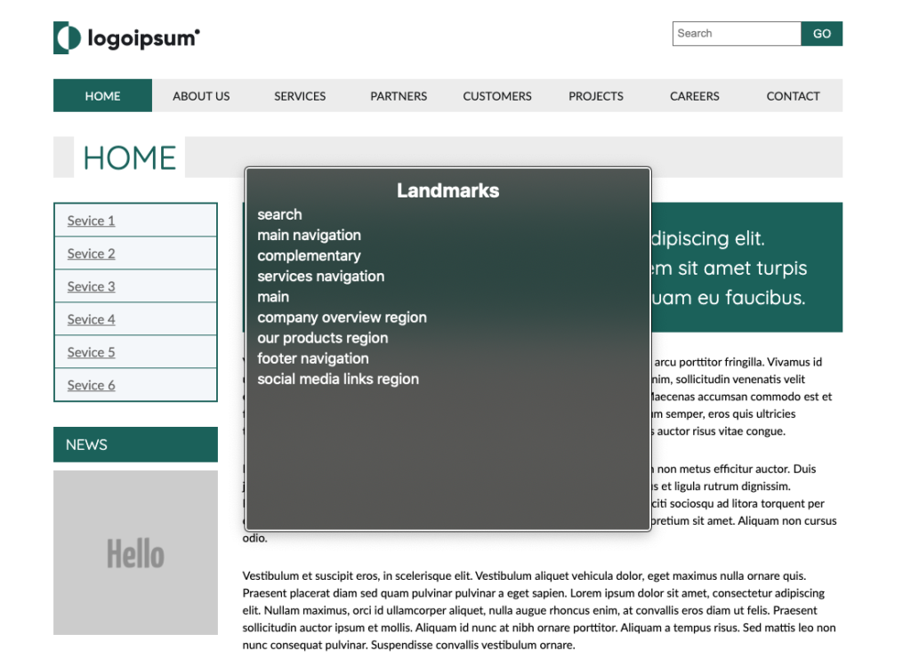
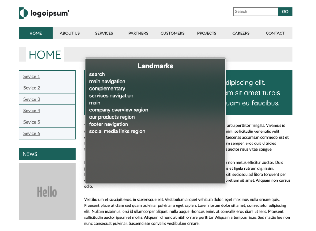
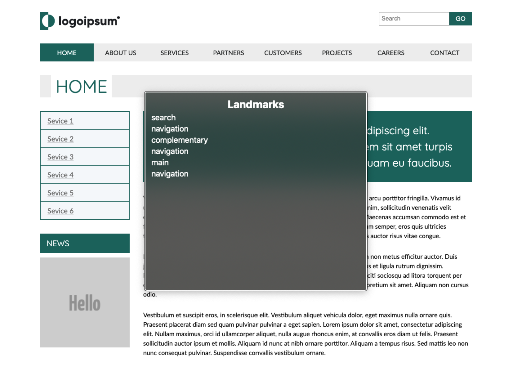
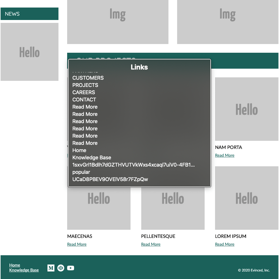
Screen readers aggregate elements on the page to lists by their type. This feature allows the user to look for landmark elements, for example. If there is a <main> element on the page, it will also appear on the list. The user can choose it on the list and skip right to it, and the same goes for any other element. You will usually find a landmarks list, form controls, headings, and more among these lists. Each screen reader may have a slightly different set of lists, but those that I mentioned can be found on all of them.

VoiceOver rotor, landmarks list.

There are two benefits to using semantic elements. First, it allows skipping directly to the element, and second, the semantics of the element implies its role in the UI layout.

Using landmark elements for the page layout is significantly helpful in bypassing recurring blocks of content, and helping screen reader users get a clear mental image of the user interface.

In order for the effectiveness of landmark elements in the description of the page layout and content to be maximized, it is worth remembering an important rule of thumb, namely that . uֹnique elements that describe the page’s general layout, such as <main>, <header> and <aside> do not require a unique accessible name. On the contrary, landmark elements that may have more than one instance on the page, such as <section> and <nav>, should be labeled so that the user can perceive the purpose of each specific instance. There are a few ways to label these elements. The most straightforward one is by adding an “aria-label” attribute with the element name as its value. 

Skip-links and proper semantic layout are great foundations and, in most cases, will be everything you need to meet the “bypass blocks”  success criterion. However, I want to mention one more method that can help see more options for troubleshooting “bypass blocks” issues. This will also improve page accessibility in general.

You can learn more about screen readers’ elements lists, how to operate them and what else we can learn from them by checking out our previous posts: 

Screen Readers 101 For Front End Developers (Mac)

Screen Readers 101 For Front End Developers (Windows)

Headings hierarchy 

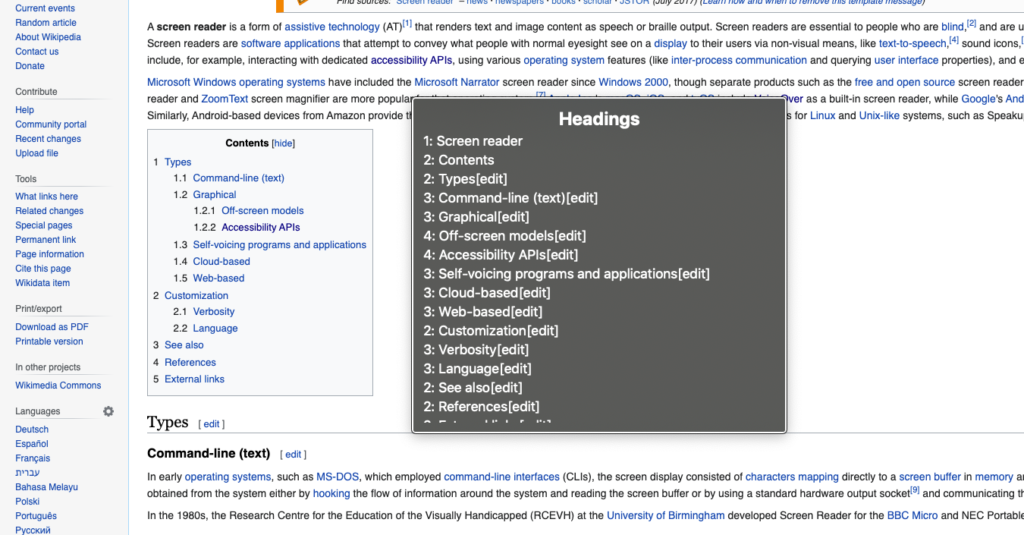
While landmark elements should represent the page layout, the headings hierarchy reflects its content structure. A good headings hierarchy acts for screen reader users as the page’s table of content.

Screen reader users can use the headings list in the same way we saw with the landmarks list. To some extent, the headings list and the landmark list complement each other in the navigation options they allow, and in the perspective of the interface they provide to the user.

Summary

The bypass block’s success criterion is mainly to address navigation issues, but we have also seen how easy-to-use navigation often depends on the clarity of the content and the layout of the interface. Fixing bypass blocks issues can often be easy wins for the developer and will significantly differ for many users. 

I hope that I have been able to move the essence of the bypass blocks success criterion and that the methods I have presented here will help you solve issues in this regard in the future.

Thank you for reading.

Published on September 15, 2020 Reading time: 22 min

Screen readers 101 for front-end developers (Windows)

Post category: Accessibility
Windows NVDA screen readers; graphic of a computer with sound waves coming out of either side.

This post was born when, while writing another post, I found myself repeatedly trying to explain and demonstrate how the examples I’ve showed will affect screen reader users. It made me realize that many front-end developers have a blind spot of an entire aspect of the interface they are working on. To some extent, it is like developing a user interface without looking at the screen. Today’s screen readers are available for all operating systems, and most (if not all) of modern OSs have a built-in screen reader. Therefore, I thought it would be a good idea to compile a short guide to essential screen reader usage to help front end developers adding it as an additional item in their self-test tool belt. 

In this post, I will refer to NV Access’s NVDA (NonVisual Desktop Access). If you are a Mac user, check out the Mac version of this post here.

This post is by no means intended to be a comprehensive user guide or for making you screen-readers experts, but merely to give you a tool that lets you peek into another layer of the UI you are delivering. It may affect many users’ user experience.

We will cover in a nutshell what screen readers are and how they work, as well as a  few basic concepts for using them, mainly how to check that assistive technologies are conveying all the interface components as intended. 

What are screen readers and how do they work?

A screen reader is a form of assistive technology (usually a software) used mostly (but not only) by people with vision impairments. 

Screen readers provide audio and braille output, and most of them also have visual indicators.

Screen readers use  the operating system’s accessibility APIs to parse and read the UI to the user. The problem is that each OS provides its specific accessibility API, and sure enough, you can’t find a cross-OS screen reader. 

When it comes to the web, things are more complicated, since every browser has its own accessibility API that screen readers use to read the web page alongside the OS’s accessibility API. This assortment of APIs causes inconsistency and different ways how screen readers read the web page and support the WAI-ARIA attributes on different browsers. Therefore, each screen reader has its recommended browser for maximum compatibility. As mentioned, in this post, we will discuss NV Access’s NVDA. Firefox is its recommended browser, so therefore I’ll use this browser for the examples in this post.

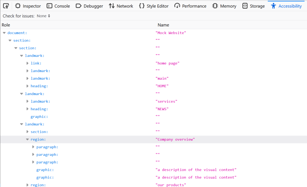
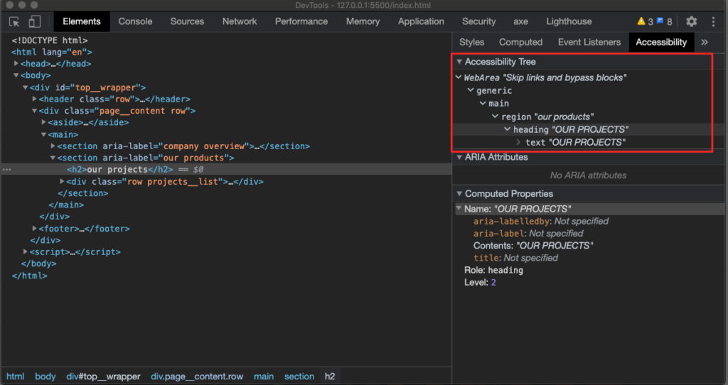
For reading web pages and web applications, screen readers use the “accessibility tree”, which is somewhat parallel to the DOM tree with the addition of accessibility features such as the definition of accessible-names and mapping of widgets states.

Firefox devtools, accessibility tree view
Firefox devtools, A11y tree view

Now that we understand what screen readers are, and some of the challenges it brings with it, let’s start working with it and see how it works.

Basic terminology

Before we install NVDA, I would like to introduce a few essential terms that NVDA uses. Some appear on first initiation so that we can be aligned:

NVDA modifier key

NVDA uses the modifier key to take over the keyboard events, so most NVDA commands require the modifier key to be pressed. By default, the Insert key is the modifier key, but NVDA gives an easy way to enable the Caps-lock key as a modifier as well, so you don’t need to keep one key pressed while you are working. Since a few keys can be used as a modifier key, it is often referred to as merely NVDA. I will use italic characters to emphasize that I am referring to the modifier key.

Focus highlight

Since screen readers are used not only by people with vision impairments, besides the auditory output, NVDA also has a visual indicator(s), called the focus highlight. There are three types of focus highlights, and each one corresponds to a different navigation method. The focus highlights are usually switched off by default, so in the next section, we will look at how to switch them on, and we will discuss each type’s role in more depth.

The elements list

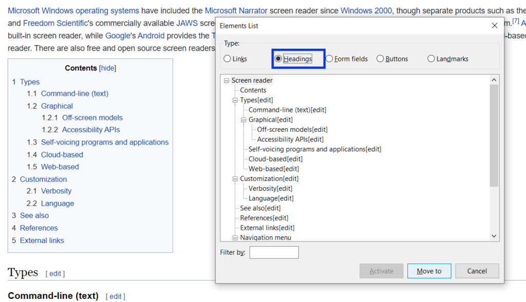
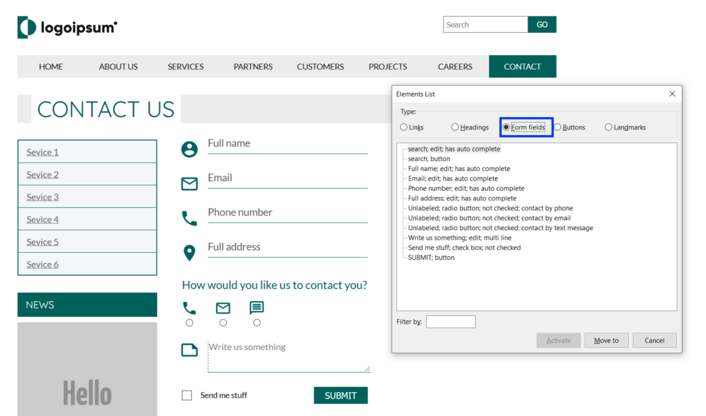
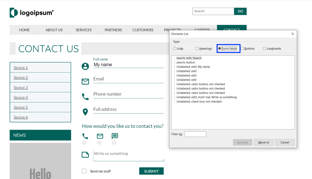
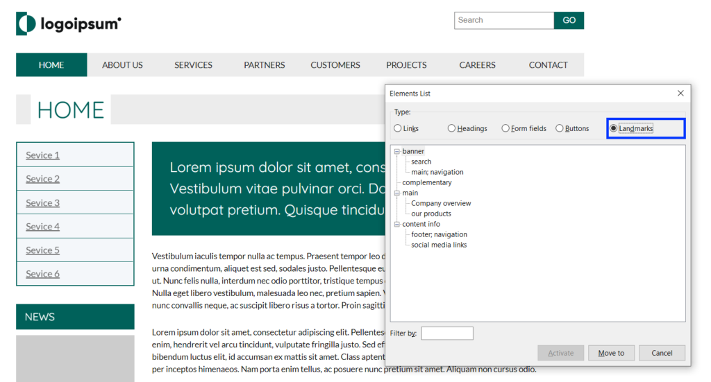
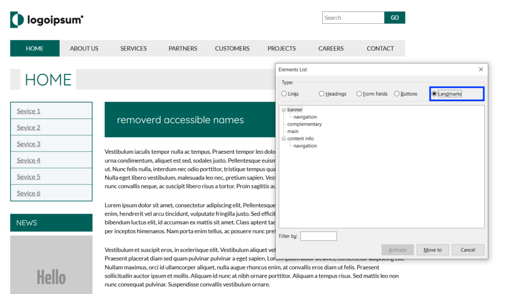
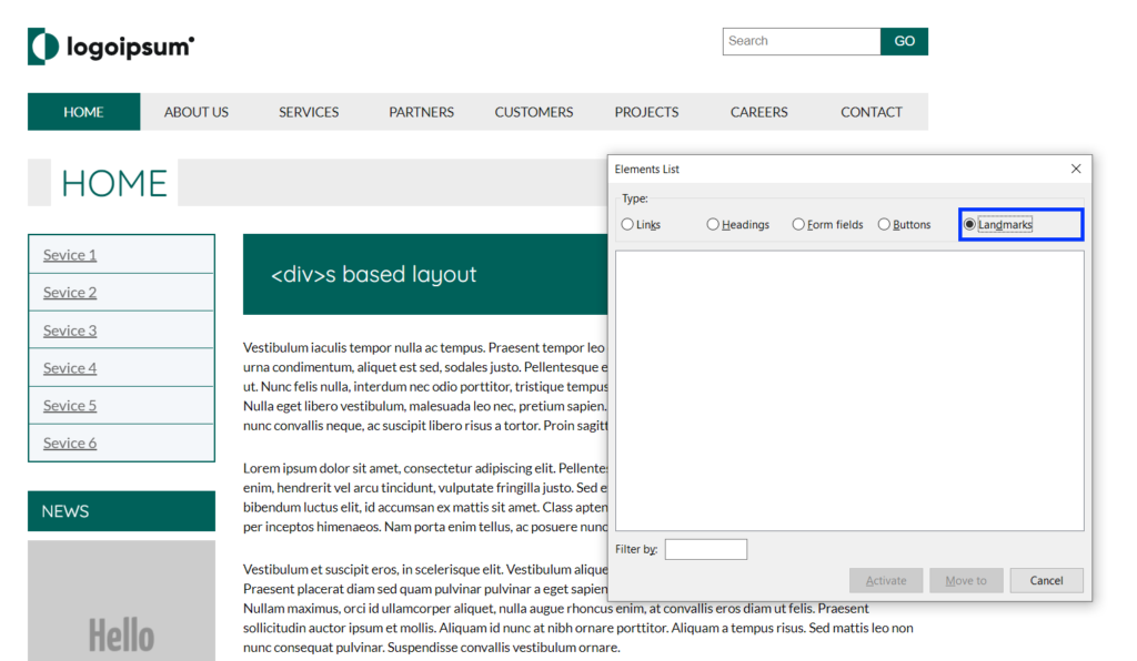
The elements list provides quick access to a list of various types of elements in the document, such as links, landmarks, heading, and more. For us as front end developers, the elements list provides a window to see what information a screen reader user has to build for himself to have a mental image of the UI. It can give us an idea of how each element is read and how the UI is structured. The elements list is the primary tool I will show on this post, which is for two reasons. The first one mentioned above gives you a good overview of some (though essential) accessibility aspects. Secondly, it provides essential insights for our needs as front end developers – even before going through the learning curve of actually working with NVDA. We will examine the elements list and see what we can learn from it about different elements’ accessibility. 

In the next section we will see how to install and configure NVDA. 

Installation and settings

First, I will mention that Windows OS, since “Windows 2000”, includes a built-in screen reader called Narrator. The reason why I chose for you to install NVDA is that it is the most popular screen reader for desktop and laptop machines nowadays. Since there are sometimes significant differences between screen readers, I chose the one that may affect the largest number of users.

Let’s start by downloading NVDA from the NV Access website. You can download it here (you will have to scroll the page a little to get to the download button).

Save and run the .exe file. You don’t need to change anything in the wizard.

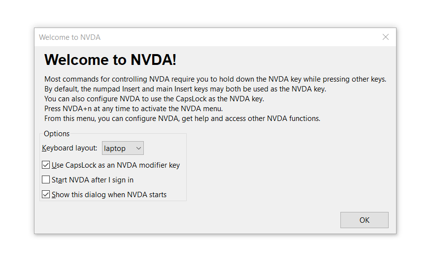
After installing and launching NVDA, you will get a welcome screen with a few explanations about the modifier key and a few basic configuration options.

NVDA Welcome window

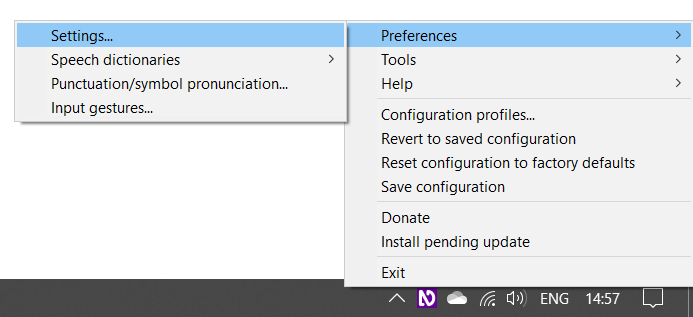
You can close this window. Now, let’s open NVDA’s settings. You can do that by pressing NVDA + n, or alternatively you can open it from the NVDA icon on the Windows taskbar.

open the NVDA settings

Speech rate

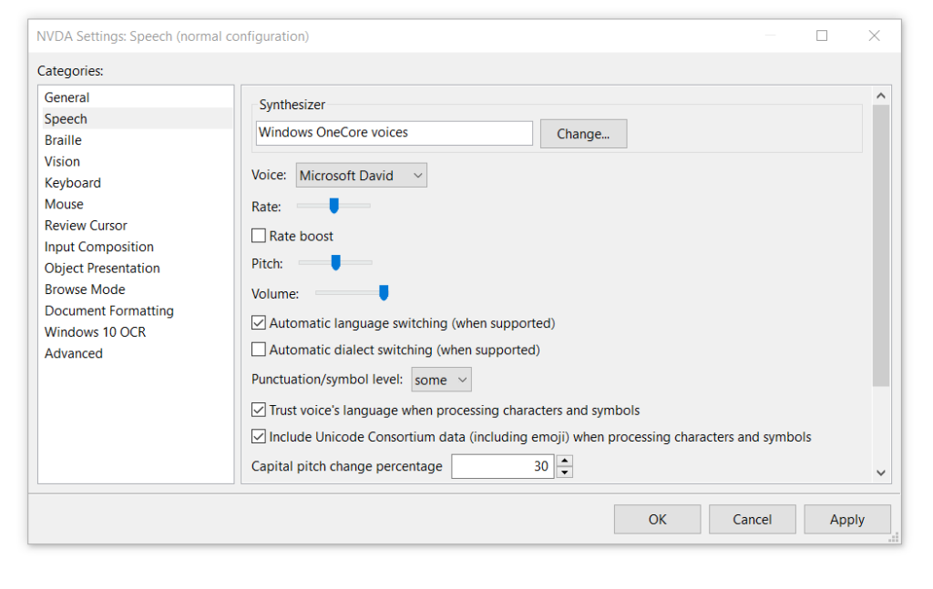
When I first opened a screen reader, it was somewhat overwhelming. In retrospect, I can say that one of the reasons for this was the screen reader’s speech rate, which was a bit fast for me, and I felt that I was missing important information. Having said that, in my opinion, NVDA’s default speech rate is very convenient – even to the novice user. However, our first goal is to make you feel comfortable using NVDA, so if you would like to adjust the speech rate, click the “speech” option on the categories pane of the settings window, where you can adjust the speech rate and some other speech related features.

NVDA settings window, showing the speech category for screen readers

Focus highlights

As a user accustomed to relying on the visual interface, I find tracking an auditory interface to be rather challenging. Therefore, in my opinion, the focus highlight is an essential feature to make our accessibility tests easier and more intuitive. 

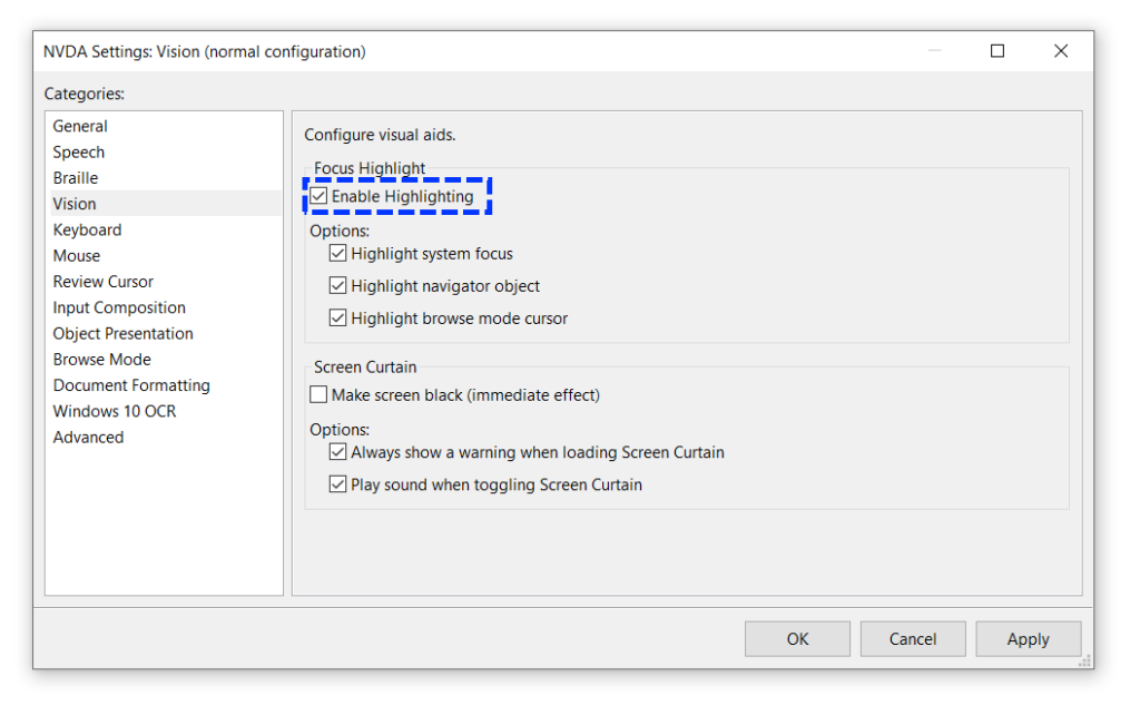
The focus highlights are off by default; you can enable it on the settings window as well. To do that, click the “vision” option on the categories pane.

NVDA settings window, showing the vision category for screen readers

As you can see, if you check the “Enable Highlights” checkbox, it will automatically highlight the three options below it; you can check any combination of options that you prefer. Let’s look at the meaning of each option.

System focus

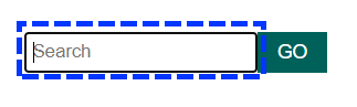
The system focus, also known simply as the focus (e.g., document.activeElement), is marked with a dashed blue frame. The system focus is applied solely to elements that can receive input from the user, such as links, buttons, text inputs, and other form controls. An element needs to be focused by a system focus for the user to be able to interact with it. You can navigate the page with the system focus by pressing Tab to go forward and Shift + Tab to go backward.

NVDA's visual system focus

Navigator object

The navigator object allows the user to explore the UI without moving the system focus, and also to explore elements that can’t be accessed normally using the keyboard, such as paragraphs (<p>) and <div>s, for example. 

A solid pink frame marks the navigator object.

NVDA's visual navigator object

Note that the navigator object does not make elements active. Even if it is set on an interactable element, the active element stays the one in which the system focus is set on. You can move the navigator to the next element by pressing NVDA + shift + right arrow, and move to the previous element by pressing NVDA + shift + left arrow. You can also drill down to child elements by pressing NVDA + shift + down arrow and go back to the containing element by pressing NVDA + shift + up arrow (on a desktop keyboard layout, use the numpad arrows).

Browse mode

Browse mode is a combination of the system focus and navigator object. The browse mode is for navigating complex documents that combine content and interactable elements, such as web pages. The browse mode allows the user to explore non-focusable elements as the Navigator object does. However, unlike this, when it gets to a focusable element, it will move the system focus to it as well, making it active. The Browse Mode’s active objects are marked with a solid yellow frame around the first letter of the line it reads, or around the graphics if there is no available text.Navigating in Browse mode is done with Down Arrow (next element) and the Up Arrow (previous element). Note that navigating in Browse mode does not require the NVDA key.

NVDA's visual browse mode

Now one could say, “we are discussing front end development of web pages and applications; all we care about is Browse mode,” and this is correct. We reviewed all the highlight types because highlighting the system focus and Navigator object is more clear and significant and, therefore, easier to work with.

There is a fourth type of highlighting. When all the cursors (highlight types) are combined, the highlight turns into a solid blue frame.

Now that we are aligned on the basic terminology and understand how to navigate pages using NVDA, let’s see how we can learn about the initial experience screen reader users get using our UI.

Quick accessibility overview with NVDA

As I mentioned above, the elements list classifies elements on the page by their type (links, buttons, form controls etc.). It also provides quick access to them without requiring the user to go linearly through all the objects until they get to it. Since the elements list classifies and presents how NVDA is going to the elements, for us as developers, it gives an overview of how screen reader users may experience the UI.

Let’s start by opening the elements list. To do that, press NVDA + f7

For those of you who would like to follow along, the examples I have added in the bottom of each section links to the pages that are used on each example.

NVDA's elements list window
The elements list window

The elements list is divided into 5 categories by the types of the elements. On the bottom of the window, you will find a text input where you can filter the elements on each list by their accessible name (the text that is read by screen readers. You can learn more about accessible names in the Evinced knowledge base) or by their type (Form fields and Landmarks lists) and level (headings list). Let’s explore each list and see which accessibility insights we can produce from each one.

Links

The links list shows a list of the links on the page, ordered by their order in the DOM. Let’s see what we can learn from this list.

NVDA's elements list window, links list
Try it yourself

As you can see, the first nine links on the list are coming from the header logo and the main navigation. They all have a unique name, and the purpose of each of them is clear. So far, so good. Right after the navigation links, you will see a bunch of links that all have the same name, “Read More“, as you can see, they are coming from the items on the main section. In this case, the words “Read More” are meaningless when disconnected from their context. Links must have unique names, so their context and purpose are clear to all users. If you have to use a generic text on a list of link elements due to UI design constraints, you can add to them an “aria-label” attribute for invisible labeling. Note that different links can have an identical name, provided they have the same URL address.

NVDA's elements list window, links list, links has no accessible names
Try it yourself

Let’s now discuss the last three items on the links list. They show the three icon links on the footer. These links have no accessible name, so NVDA is doing its best to provide the user with some names. In such cases, NVDA uses the last part of the link’s URL, but since URLs often have a query string attached to them, or when the URL name is based on the page ID, the name that’s eventually read to the user is not descriptive, nor does it have meaning for the user.

Signs to possible links related a11y issues

  1. The same link name is repeated multiple times.
  2. Links names are not meaningful, or not describing the link’s destination correctly.

Headings

Let’s start by looking at the headings list, and see what we can learn from it. 

The headings structure and hierarchy in a web page should act as its table of contents; thus, the user can always understand the context of the content piece the screen reader is currently reading. It also allows quick access to the exact part of the content that the user is interested in, without making them go linearly through all the content on a page until they get to where they want to be.

NVDA's elements list window, links list, on a Wikipedia page, useful to know when developing for screen readers

The example above shows the headings hierarchy of a Wikipedia page. It shows the headings ordered by their position on the DOM. The heading levels are ordered in a tree view, and each level represents a sub topic of the heading above it, and sure enough, you can see that the headings hierarchy and order on the elements list match the table of contents of the page This is a good example of a good headings hierarchy, which allows the user to get a good mental image of the page’s content hierarchy. You can filter the headings by their level by typing a number between 1-6, or by their content by typing their internal text.

Signs to possible headings related a11y issues

  1. The headings list is empty: Headings are essential for screen reader users to get acquainted with the page and understand its overall and each part’s context. If the headings list is empty, ask yourself if a user, who cannot see, has the information available to get acquainted with the UI and is able to get a full mental image of it.
  2. Headings levels are inconsistent or the tree view looks broken: Inconsistent use of headings levels causes a lack of clarity of the UI structure and fails to imply the importance of each of the different content pieces for screen reader users.

Form fields

The form fields list is a critical one. It displays the type of elements that requires user input, such as <button />s, <input /> elements, and <textarea />s. Problems found in this list may therefore indicate that some users are unable to perform basic operations on the site. 

Let’s look at two necessary conditions for a user to be able to interact properly with UI widgets.

  1. How to use it: The users must understand how they should interact with it and therefore they must understand what the element’s type is. Different input elements may require different types of interaction (typing or clicking, for example).
  2. The outcome: The second condition that must be met is that the user will be able to assess the result of interacting with the element. The information that is supposed to imply this to the user is the element’s accessible name; therefore, this type of element must be labeled correctly.

Let’s see how this is reflected in the form fields list to get an idea of how screen reader users are affected by it.

NVDA's elements list window, form fields list.

The image above shows you how an ideal page looks.  On the elements list window, you can see how each of the elements on the list has an explicit type and name (even though, for some reason, the radio buttons and checkbox appearance on the list start with the word “unlabeled”, they end with the correct name and NVDA is reading it properly). The user therefore has enough information to quickly understand how they should interact with each element, and what its purpose is.

I’ve made some changes to the page that the average user will not notice, since the page’s functionality has allegedly not changed. However, for screen reader users, the form on the page has become unusable. I have replaced the form’s <label />  tags with <span />s and the <button /> tag of the “submit button” is replaced with an <a /> tag.  Let’s see how the form controls list looks now.

NVDA's elements list window, form fields list. Fields has no accessible names

The first two items are the search input and button from the page header, and these stay unchanged.  

The next item on the list looks like it has a name: “My name”, but if you will look at the image, you can see that this is actually the input value. I put it there to emphasize that the text on each field, which looks like a placeholder, is actually the label element (and on this example span).

Right below it, the next three empty inputs show as “Unlabeled: edit” and the same goes for the three radio buttons. Note that they don’t have a name ending each line now. You can see how a screen reader user just can’t know what kind of data they should type to each input or what the purpose of the radio buttons is.

Next, we have a <textarea> element, which also starts with the word “Unlabeled” and ends with: “Write us something”. It also looks that, unlike the name input, it doesn’t have any value typed into it, so where does it get its accessible name from? Something that the <textarea> has on this example, and which the other <input /> element doesn’t, is a “placeholder” attribute. I use this example because not all screen readers support this attribute as an accessible name, so even though it works perfectly with NVDA, it is not recommended to rely on it as an alternative to other labeling methods.

Next, is the checkbox that has the same issue as the radio buttons, and last, the submit button is missing. You will remember that the button was replaced with an anchor tag, all its functionality stayed the same and the same event listener is attached to it and still the NVDA is not classifying it as a button. From this we can learn that when the semantic role of elements is incorrect the user may have difficulty finding them in the places he expects and to interact with them correctly.

Signs to possible form fields related a11y issues

  1. Form fields names start with the word Unlabeled (sometimes the name on the list ends with a proper name. If it is not coming from a value that was typed by the user or a placeholder attribute you can consider it labeled).
  2. Elements you expect to find on the list are missing from it.

Buttons

The buttons list probably shows all the buttons on the page. We will not delve into this list since button elements are also displayed in the form fields list, the same principles we discussed in the previous section apply here. This list is useful when we want to test the accessibility of buttons outside the form’s context.

Landmarks

Landmark elements are HTML elements that have an explicit role in the UI structure, such as <nav />, <main />, <header />, and <footer />. The landmarks list should represent the different components of the UI’s layout. For a better understanding about the usage of these elements on the screen reader users’ experience, let’s look at an example on how landmarks are reflected on the elements list.

First let’s look at a page that represents the ideal DOM structure Tt is built with semantic landmark elements and each of the landmarks is properly labelled.

NVDA's elements list window, landmarks list.
Try it yourself

In the image above, you can see the list of the landmark elements in a tree view. If referred to the headings list as the table of contents of the page, we can refer to the landmarks list as the page’s blueprint. The landmarks’ treeview should reflect the page’s structure and the role of each part. You can see how the elements of the first level are not labeled since they are unique and therefore do not require unique names. I am referring to the banner (<header/>), complimentary (<aside/>), main, and content info (<footer/>). On the next levels, non-unique elements such as navigation widgets and sections are labeled with an accessible name so that the user can understand their context and purpose. The elements that only have names without a type specification, are <section/> elements. Their type is not specified since their semantic meaning is dependent on their label, otherwise they are acting simply as <div>s. 

A note about nesting landmarks: I am not sure if it is a bug or by design, but when a landmark element is the first child of another landmark element, it does not show on the treeview. For example, the services list on the sidebar is actually a <nav> element, and it also has a unique label, and yet, it is not shown in the treeview. However, NVDA is still reading it to the user as it should, but I am pointing it out since it may be confusing.

Now, let’s look at the same page with a slight change. I have removed the accessible names from the non-unique elements, so let’s see how it affects the screen reader users’ user experience.

NVDA's elements list window, landmarks list. Landmarks has no accessible names
Try it yourself

The image above shows how the landmarks list looks when the landmark elements are not labeled. 

First, you can see that we still have the two navigation elements, but now we can’t tell or conclude the purpose of each of them. 

Second, all the <section /> elements are not there anymore. This is because, as mentioned above, when a <section /> element is not labeled, it is considered by NVDA as a generic container, just like a <div /> element. Therefore, it omits it from the landmark menu. Nevertheless, <section /> elements will still be registered by accessibility APIs to the accessibility tree with their semantic role. 

I think this example clearly illustrates the vast difference in user experience when elements are labeled with an accessible name to hint the element’s content and purpose. Let’s take it one step feather and see what the landmarks list displays if we choose to use only <div />s for our UI.

NVDA's elements list window, landmarks list. divs based layout
Try it yourself

Now, we do not even have the option to navigate to a <nav /> element quickly and hope that this is the element we are looking for. As you can see, the Landmarks list is now empty, and as screen reader users, we don’t get any information on the page’s structure and layout.

We can see that, just as the visual layout helps the average user to find their way in the interface and understand its purpose, the semantics of the elements that make up the interface should reflect the UI’s different components’ roles for the benefit of screen reader users. 

Signs to possible landmarks related a11y issues

  1. The landmarks menu is empty.
  2. Items on the landmarks menus have no accessible names (not labeled).
  3. The layout is ordered in a way that does not make sense (header that appears before or nesting inside a footer for example).

Summary

The examples I have given here in no way represent a complete accessibility test. Still, they indeed show how you can get a good idea of what the initial experience of screen reader users from the interface will be at a glance.

To summarize, I hope you find this guide useful and that it will help you make screen readers an additional tool in your tool belt and the efforts for a more inclusive web.

If you wish to learn about NVDA in more depth, check out NV Access’s online user guide or you can support NVDA (which is an open source project BTW) by purchasing their comprehensive training books. 

NVDA’s GitHub repository

Thank you for reading!

Published on September 13, 2020 Reading time: 16 min

Screen readers 101 for front-end developers (Mac)

Post category: Accessibility
MacOS, VoiceOver graphic of a computer with sound waves coming out of either side.

This post was born when, while writing for another post, I found myself repeatedly trying to explain and demonstrate how the examples I’ve showed, affect screen reader users. It made me realize that many front-end developers have a blind spot of an entire aspect of the interface they are working on. To some extent, it is like developing a user interface without looking at the screen. Today’s screen readers are available for all operating systems, and most (if not all) modern OSs have a built-in screen reader. I therefore thought it would be a good idea to write a short guide to essential screen reader usage to help front end developers adding it as an additional item in their self-test tool belt. In this post, I will refer to MacOs VoiceOver. If you are a Windows user, check out the Windows version of this post here.

This post is by no means intended to be a comprehensive user guide or for making you screen-readers experts, but merely to give you a tool that lets you peek into another layer of the UI you are delivering. It may affect many users’ user experience.

We will cover in a nutshell what screen readers are and how they work, as well as a  few basic concepts for using them, mainly how to check that assistive technologies are conveying all the interface components as intended. 

What are screen readers and how do they work?

A screen reader is a form of assistive technology (usually a software) used mostly (but not only) by people with vision impairments. 

Screen readers provide audio and braille output, and most of them also have visual indicators.

Screen readers use the operating system’s accessibility APIs to parse and read the UI to the user. The problem is that each OS provides its specific accessibility API, and sure enough, you can’t find a cross-OS screen reader. 

When it comes to the web, things get even more complicated, since every browser has its accessibility API, which screen readers use to read the web page alongside the OS’s accessibility API. This assortment of APIs causes inconsistency and differences with how screen readers read the web page and support the WAI-ARIA attributes on different browsers; therefore, each screen reader has its recommended browser for maximum compatibility. In this post, we will discuss Apple’s VoiceOver. Safari is its recommended browser; nevertheless, I usually use VoiceOver with Google Chrome, and in almost all cases, it works as expected.

For reading web pages and web applications, screen readers use the “accessibility tree”, which is somewhat parallel to the DOM tree with the addition of accessibility features, such as the definition of accessible-names and mapping of widgets states.

Chrome devtools, accessibility tree view
Chrome devtools, A11y tree view

Now that we understand what screen readers are and which challenges it brings, let’s start working with it and see how it works.

Installation and settings

Mac users are lucky as they are free from any download/installation process, since VoiceOver is part of the OS X bundle. They can therefore start by turning VoiceOver on by pressing “command + F5″ (the same key combination also turns it off).

Another option is to open System Preferences > Accessibility > VoiceOver, and check the “Enable VoiceOver” checkbox.

Mac OS, accessibility settings window, VoiceOver

When I first opened a screen reader, it was somewhat overwhelming. In retrospect, I can say that one of the reasons for this was the screen reader’s speech rate, which was a bit fast for me. I also felt I was missing important information. Therefore, if you too feel a little overwhelmed, you can adjust the speech rate by getting to the VoiceOver setting as shown above, and clicking the “Open VoiceOver Utility” button on the bottom of the window.

Mac OS, accessibility settings window, open VoiceOver utility settings

Here you can set the preferences of VoiceOver, add languages, change the narration voice and style, set the output type (auditory, braille, or both), and more. We are here now to adjust the speech rate.

VoiceOver settings, speach, set speech rate.

On the new window that is open now, click on the “Speech” option on the left side and change the rate column’s speech rate on the right. A lower value slows the speech pace. The system will read you a sample text each time you change the rate value to get it to the point where it feels comfortable and less overwhelming. This is as much as we are going to dive into the VoiceOver settings, but it is all pretty straightforward. 

Next, we will discuss some VoiceOver terminology.

Basic terminology

In this section we will overview a few essential terms that VoiceOver uses and the concepts behind them.

VO keys

VoiceOver uses the control + option keys combination to take over and control the keyboard events. This key combination is usually referred to as the VO keys. However, almost every action you wish to take with VoiceOver will require this key combination. VoiceOver will give you instruction while using it and guide you when to use the VO keys and other required key combinations.  You can lock (and unlock) the VO keys, so you don’t need to hold them by pressing control + option + ;.

VO cursor

Since screen readers are not only used by people with vision impairments, VoiceOver, besides the auditory output, also has a visual indicator, called the VoiceOver cursor. The VO cursor is a black frame that indicates which piece of the UI the screen reader is currently reading. As a user accustomed to referring to the UI in its visual context, the VO cursor is very handy, as it makes the connection between the visual and auditory UI. As a front-end developer, the VO cursor can help you understand how the screen reader conveys and outputs each of the DOM elements to the user.

VoiceOver's visual cursor.
The VO Cursor

The VO rotor

The VoiceOver rotor is a rotating menu that allows users to quickly access elements by their types, like headings, links, and landmarks. For us, as front-end developers, it provides a quick look on how VoiceOver is reading the elements of the UI. The VO rotor will therefore also be at the center of the examples I will bring later in this post.

To turn on the VO rotor, press “control + option + u.” You should be able to see the rotor modal and be able to page through the different elements’ types, using the right and left arrow keys. To navigate between elements on each list, use the up and down keys (there is no need to keep holding the VO keys in both cases).

Next, we will look at a few of the VO rotor’s different lists and see how we can detect accessibility issues with them, and also better understand the user experience of screen reader users.

Quick accessibility overview with VoiceOver

For those of you who would like to follow along – the examples I have added in the bottom of each section link (Try it yourself) to the pages that are used on each example.

Headings

Let’s start by looking at the headings list, and see what we can learn there. (Remember, you can get to it by using the Right and Left arrows when the rotor is opened.) 

The headings structure and hierarchy in a web page should act as its table of contents; thus, the user can always understand the context of the content piece that the screen reader is currently reading. It also allows quick access to the exact part of the content that the user is interested in, without making them go linearly through all the page content until they get to the piece of the content they wanted to get.

VoiceOver rotor, headings list on a Wikipedia page.

See the example above. It shows the heading hierarchy of a Wikipedia page. The headings are ordered by their position on the DOM, the heading levels are in an ascendant order and each level represents a sub topic of the heading above it. You can see that the headings hierarchy and order on the rotor modal window match the table of contents of the page. This is a perfect example of a suitable headings hierarchy that allows the user to get a good mental image of the page’s content hierarchy. You can filter the headings by their level by typing a number between 1-6, or by their content by typing their internal text.

Signs to possible headings related a11y issues

  1. The headings list is empty: Headings are essential for screen reader users to get acquainted with the page and understand its overall and each part’s context. If the headings list is empty, ask yourself if a user, who cannot see, has the information available to get acquainted with the UI and to get a full mental image of it.
  2. Headings levels are inconsistent and not in an ascending order: Inconsistent use of headings levels causes a lack of clarity of the UI structure. It fails to imply the importance of each of the different content pieces for screen reader users.

Landmarks

Landmark elements are HTML elements that have an explicit role in the UI structure, such as <nav />, <main />, <header />, and <footer />; the landmarks list should represent the different components of the UI’s layout. To better understand how the usage of these elements on the screen reader users’ experience, let’s look at an example for how landmarks are reflected on the VO rotor.

First, let’s look at a page that represents the ideal DOM structure. It is built with semantic landmark elements and each of the landmarks is properly labelled.

VoiceOver rotor, landmarks list.
Try it yourself

In the image above, you can see the list of the landmark elements; the non-unique elements, such as <nav /> and <section /> (regions), are labeled with an accessible name, so the user can grasp their context. To label the elements, I used the “aria-label” attribute.

Now, let’s look at the same page with a slight change. I have removed the accessible names from the non-unique elements, so let’s see how it affects the screen reader users’ user experience.

VoiceOver rotor, landmarks list. Elements has no accessible names
Try it yourself

The image above shows how the landmark list looks when the landmark elements are not labeled. 

First, you can see that we still have three navigation elements, but now we can’t tell or conclude the purpose of each of them. 

Second, all the <section /> elements are not there anymore, but the markup itself did not change at all. The only change I made was to remove the “aria-label” attributes; however, when a <section /> element is not labeled, it is considered by VoiceOver as a generic container – just like a <div /> element. Therefore, it omits it from the landmark menu. Nevertheless, <section /> elements will still be registered to the accessibility tree by accessibility APIs with their semantic role. 

I think this example clearly illustrates the vast difference in user experience when elements are labeled with an accessible name to hint the element’s content and purpose. Now, let’s take it one step further and see what the landmarks list displays if we choose to use only <div />s for our UI.

VoiceOver rotor, landmarks list. divs based layout
Try it yourself

Now, we do not even have the option to quickly navigate to a <nav /> element and hope that this is the element we are looking for; now the Landmarks list is replaced with a “Loading more items…” message. In some cases the list will not show up at all if it has nothing to display (other rotor lists will still show if they have content to display). 

Signs to possible landmarks related a11y issues

  1. The landmarks menu is empty.
  2. Items on the landmarks menus have no accessible names (not labeled).
Links

The links list shows a list of the links on the page, ordered by their order in the DOM. Let’s see what we can learn from this list.

VoiceOver rotor, links list

I have scrolled down the links list on the example above to show the page’s bottom part links. On its top, you can see the last links of the main navigation. They all have a unique name, and the purpose of each of them is clear. So far, so good. Right after the navigation links, you will see a bunch of links that all have the same name, “Read More”. As you can see, they are coming from the items behind the rotor’s modal window. In this case, the words “Read More” are meaningless when disconnected from their context. Links must have unique names, so their context and purpose are clear to all users. If you have to use a generic text on a list of link elements due to UI design constraints, you can add to them an “aria-label” attribute for invisible labeling. Note that different links can have an identical name provided they have the same URL address.

Let’s now discuss the last three items on the links list. They are showing the three icon links on the footer. These links have no accessible name, so VoiceOver is doing its best to provide the user with some names. In such cases, VoiceOver uses the last part of the link’s URL, but since URLs often has a query string attached to them or when the URL name is based on the page ID, the name that’s eventually read to the user is not descriptive nor does it have meaning for the user.

Signs to possible links related a11y issues

  1. The same link name is repeated multiple times.
  2. Links names are not meaningful, or not describing the link’s destination correctly.

Form controls

The form controls list is a critical one. It displays the type of elements that requires user input, such as <button />s, <input /> elements, and <textarea />s. Therefore, problems found in this list may indicate that some users are unable to perform basic operations on the site. 

Let’s look at two necessary conditions for a user to be able to interact properly with UI widgets.

  1. How to use it: The users must understand how they should interact with it; thus, they must understand what the element’s type is. Different input elements may require different types of interaction (typing or clicking, for example).
  2. The outcome: The second condition that must be met is that the user will be able to assess the result of interacting with the element. The information that is supposed to imply this to the user is the element’s accessible name; therefore, this type of element must be labeled correctly.

Let’s see how this is reflected in the form controls list to get an idea of how screen reader users are affected by it.

VoiceOver rotor, form controls list
Try it yourself

The image above shows you how an ideal page looks.  On the rotor window, you can see how each of the elements on the list has an explicit type and name. The user therefore has enough information to quickly understand how they should interact with each element, and what its purpose is.

I’ve made some changes to the page that the average user will not notice since the page’s functionality has allegedly not changed. However, for screen reader users, the form on the page has become unusable. I have replaced the form’s <label />  tags with <span />s and the <button /> tag of the “submit button” is replaced with an <a /> tag.  Let’s see how the form controls list looks now.

VoiceOver rotor, form controls list. Form fields has no accessible names

The first two items are the search input and button from the page header and these stay  unchanged. 

The next item on the list looks like it has a name: “My Name”, but if you will look at the image, you can see that this is actually the input value, I put it there to emphasize that the text on each field which looks like a placeholder is actually the label element (and on this example span).

Right below it the next three empty inputs show as “edit text” and the same goes for the three radio buttons. You can see how a screen reader user just can’t know what kind of data they should type to each input or what the purpose of the radio buttons is.

Next we have a <textarea> element, which looks like it has an accessible name “Write us something”. It also looks that, unlike the name input, it doesn’t have any value typed into it, so where does it get its accessible name from? Something that the <textarea> does have on this example, and which the other <input /> element doesn’t, is a “placeholder” attribute. I brought this example because not all screen readers support this attribute as an accessible name, so even though it works perfectly with VoiceOver, it is not recommended to rely on it as an alternative to other labeling methods.
Next, is the checkbox that has the same issue like the radio buttons, and lastly, the submit button is missing.;You will remember that the button was replaced with an anchor tag, all its functionality stayed the same and the same event listener is attached to it and still the VoiceOver is not classifying it as a button. From this we can learn that when the semantic role of elements is incorrect the user may have difficulty finding them in the places he expects and to interact with them correctly.

Signs to possible form fields related a11y issues

  1. Form fields have no unique names (make sure that the names appearing on the rotor are not coming from values that were typed by the user or from a placeholder attribute).
  2. Elements you expect to find on the list are missing from it.

Articles

For the final list I would like to discuss, I will dedicate just a few words; the articles list displays all the DOM elements that VoicOver can read. For example, you can use this list if you expect to find a certain element on another list but can’t find it there. You can filter items on the list by typing their content or name.

Summary

The examples I have given here in no way represent a complete accessibility test. Still, they indeed show how you can get a good idea of what the initial experience of screen reader users from the interface will be at a glance.

To summarize, I hope you find this guide useful and that it will help you make screen readers an additional item in your tool belt and the efforts for a more inclusive web.

If you wish to learn about VoiceOver in more depth, check out Apple’s VoiceOver user guide and the Commands and Gestures table.

Thank you for reading!

Published on August 24, 2020 Reading time: 20 min

Creating accessible combo boxes

Post category: Accessibility
Make accessible combo boxes

In this post, we will discuss how to build an inclusive, keyboard, and screen-reader friendly combo box. 

We will cover: 

  1. Defining element semantics 
  2. Defining element relationships
  3. Styling for accessibility
  4. Managing states and values for screen readers

Since we will focus on the accessibility aspects, we will not cover the entire example code. If you want to follow along, you can find the full code for this post’s example on this Github gist and this live demo on CodePen.

What is a combo box, and what accessibility challenges does it entail?

Combo box, as its name implies, is usually made up of a combination of two or more widgets. Traditionally, it is a combination of a drop-down list and a single-line editable textbox, allowing the user to either type a value directly or select an option from the list. Sometimes the term “combo box” is used to indicate “drop-down/select list” (e.g. <select>) since these two widgets have a lot in common, in this post we are going refer to the first type.

Whether you want to build a styled select-list or a classic combo box, the accessibility challenges are mostly similar. The WAI (The W3C’s Web Accessibility Initiative) defines the accessibility requirements of the combo box design pattern on WAI-ARIA Authoring Practices 1.1 and covers various types of combo boxes, including select-lists.

To begin, let’s see what we want to achieve and what are the accessibility challenges this design pattern produce:

Combo box anatomy, general view
Combobox anatomy, general view

Naming and labeling

Combo box is a UI element that requires user input, therefore it must have an accessible name to meet the WCAG’s “3.3.2 Labels or Instructions” and “4.1.2 Name, Role, Value” success criteria.

Unlike native HTML elements that require user input, it is made up of several different HTML elements, with different roles and semantics. Which of the parts that make up the combo box should be labeled? The accessible name is also meant to help with the “operating instructions” of UI elements, so how do you name a UI element that consists of several elements so that the function of each part is clear  – either individually or in the larger context? 

You can read more about accessible names and their roles on the Evinced knowledge base.

Relationships

As already mentioned, a combo box is made up of a few different HTML elements. User interaction with each element may affect the state of other elements. For example, typing into the input field will change the visibility and content of the select list; and clicking the button is toggling the list visibility. This contextual relationship between the different combo box components should be conveyed programmatically so that screen readers can read them clearly and correctly.

Widget states

The combo box select-list usually consists of a list element (<ul>, <ol>) or a collection of <div>s, which doesn’t have “built-in” state attributes. How can we therefore convey the following to the user correctly: the different combobox states, whether the select list is expanded, which item is selected etc.? Also, what do assistive technologies need to get this information?

Handling keyboard navigation

Certain behaviors are expected from a combo box, for example letting the user navigate up and down the select-list using the up and down arrow keys, or selecting an item by clicking the Enter key and other, when it is highlighted. While these behaviors apply to native HTML elements like <select> elements (which we are actually trying to mimic), on our combo box, we will have to handle it programmatically with Javascript and also override some of the keys’ default behaviors.

The markup 

Let’s begin with the markup. We will start with the general construction, and then we will add the attributes that are used by the accessibility APIs that are required for assistive technologies to read it correctly. We will explain the role of each one.

<div class="combo-wrapper">
    <div class="combo-controls">
        <input type="text" />
        <button >▾</button>
    </div>
    <ul>
        <!-- The list items will be added dynamically -->
    </ul>
</div>
Combo box anatomy, general view with its corresponding class names

Now that we have the basic structure, let’s start taking care of the accessibility matters by semantically defining the component as a combo box. The common user can identify the role and purpose of UI elements by their layout and appearance. Screen readers, on the other hand, do not have the ability to parse visual data and therefore they are depended on the semantics of the DOM to read it to the user correctly (e.g. using <button> tags for buttons, <a> tags for links, etc.), only there is no semantic HTML combo box element. There are quite a few commonly used UI components such as tabs, pop-up modals and menu-bars that do not have equivalent HTML element/s. WAI identified this gap and added to the WAI-ARIA roles model a list of common UI component roles to be used and parsed by the accessibility APIs. Combo box is among them.

Applying semantic roles

<div class="combo-wrapper">
    <div class="combo-controls">
        <input role="combobox" type="text" />
        <button> ▾ </button>
    </div>
    <ul role="listbox">
         <!-- The list items will be added dynamically -->
    </ul>
</div>

We can therefore add to the <input> element role=”combobox” attribute, but there is an important note about this choice: In almost every other case I would not recommend adding a different semantic role to an element that already has semantic meaning. It is considered to be a bad practice since the role attribute is meant to apply semantics to non-semantic elements (e.g. <div>, <span>) or to extend the semantics of an element, for example like applying role=”switch” to a checkbox element. Nevertheless, after testing other options, like adding the role=”combobox” to the <div class="combo-controls"> as the WAI suggests, I realized that the only way the screen readers I checked announced the combo box correctly, and not ignore it, was when it was added to the <input> element, and since the input element is part of the widget, the semantics do not contradict (I have tested Mac OS VoiceOver with Chrome, FireFox and Safari and NVDA with Chrome. FireFox and Edge).

To the list element we will add role=”listbox”. This will allow screen readers to refer to the list element as the listbox of <select> elements, that is to say a list with selectable items.

Labeling

The next step is to label the combo box. We would like to first label the whole combo box, for that purpose we can use the <label> element and link it to the input element. The reason we are linking it precisely to this element is that it is the first element of the combo box screen readers read (they skip the <div class=”combo-controls”> element because it does not contain any text nodes. This is also why we had to add the role attribute to the input element). Besides that, when a label element is linked to an input element, clicking on it will set focus on the input, a behavior that serves us well, also with a combo box.

Now we would like to associate the listbox with the same <label> element. Here we have 2 problems: 1. Each <label> elements “for” attribute can be linked only to 1 element. 2. Only form elements should be linked to <label> elements. For such cases, the WAI introduces the aria-labelledby attribute, this attribute allows you to use any element that contains a text node as a labeling element by referring to its id.

The last step is to label the button, and we can use the same approach. Thus we also produce a logical connection between all the elements that make up the combo box.

<label for="combo-input" id="combo-label">
    Combobox Name
</label>
<div class="combo-wrapper">
    <div class="combo-controls">
        <input id="combo-input"  role="combobox" type="text" />
        <button aria-labelledby="combo-label"> ▾ </button>
    </div>
    <ul aria-labelledby="combo-label" role="listbox">
        <!-- The list items will be added dynamically -->
    </ul>
</div>

Setting relationships
We can help screen readers read the component in a more accurate and user-friendly way by noting the relationships between the various elements. We can do so by adding the “aria-controls” attribute to the <input> and <button> elements and linking it to the list element to signify that these controls are controlling the visibility of the list-box.

<label for="combo-input" id="combo-label">
    Combobox Name
</label>
<div class="combo-wrapper">
    <div class="combo-controls">
        <input
            aria-controls="combo-listbox"
            id="combo-input" role="combobox"
            type="text" />
        <button 
            aria-controls="combo-listbox"
            aria-labelledby="combo-label">
             ▾
        </button>
    </div>
    <ul 
        aria-labelledby="combo-label"
        id="combo-listbox"
        role="listbox">
           <!-- The list items will be added dynamically -->
    </ul>
</div>

A note regarding the “aria-controls” attribute: this attribute is supported by only one screen reader, namely JAWS. Nevertheless, in my opinion, adding an attribute is only a small effort considering that, even though JAWS surpassed the premiere to NVDA in popularity according to the 2019 WebAIM’s screen readers survey, it is still reported to be the primary screen reader of 40.1% of desktop screen reader users and this is not a negligible amount of users.

State attributes
In order to indicate to the user whether the list-box is expanded or collapsed, we will add the aria-expanded attribute to the input element with an initial value of “false”. We will programmatically update it later, when the state is changing.

Even though it is not common and allegedly belongs to another accessibility design pattern (menu button), I think it is a good idea to also add the aria-expanded to the button element since it also affects the list-box’s state.

<label for="combo-input" id="combo-label">
    Combobox Name
</label>
<div class="combo-wrapper">
    <div class="combo-controls">
        <input
            aria-controls="combo-listbox"
            aria-expanded="false"
            id="combo-input"
            role="combobox"
            type="text" />
        <button
            aria-controls="combo-listbox"
            aria-expanded="false"
            aria-labelledby="combo-label">
            ▾
        </button>
    </div>
    <ul aria-labelledby="combo-label" id="combo-listbox" role="listbox">
        <!-- The list items will be added dynamically -->
    </ul>
</div>

Additional attributes
There are a few more attributes we can add to provide an inclusive as possible user experience. First, we want to add an aria-haspopup=”listbox” attribute to the input and button elements to indicate that they are triggering the appearance of a list-box. Secondly, we would like to add the aria-autocomplete attribute, which should indicate to the user the type of autocompletion that’s applied. It can take one of three values: “list”, “inline” or “both”. To be honest, none of the screen readers I have tested supported this attribute, nor could I find any documentation about its support. However, it is defined as a required attribute on the WAI-ARIA’s combo box design pattern description so we are going to add it anyway.

If the combo box provides autocompletion behavior for the text input as described in aria-autocomplete, authors MUST set aria-autocomplete on the textbox element to the value that corresponds to the provided behavior.

We will start with a “list” value.

<label for="combo-input" id="combo-label">
    Combobox Name
</label>
<div class="combo-wrapper">
    <div class="combo-controls">
        <input
            aria-autocomplete="list"
            aria-controls="combo-listbox"
            aria-expanded="false"
            aria-haspopup="listbox"
            id="combo-input"
            role="combobox"
            type="text" />
        <button
            aria-controls="combo-listbox"
            aria-expanded="false"
            aria-haspopup="listbox"
            aria-labelledby="combo-label"
            tabindex="-1">
            ▾
        </button>
    </div>
    <ul aria-labelledby="combo-label" id="combo-listbox" role="listbox">
        <!-- The list items will be added dynamically -->
    </ul>
</div>

Now that the markup is set up for now, we still need to handle the list items that are going to populate the list-box. We are going to do that via Javascript.

CSS

When it comes to styling, there are three things we have to take into consideration from the accessibility point of view:

  1. The input[type=”text”] element must have a discernible focus indicator.
  2. The list items must have a discernible “active/selected” indicator.
  3. When the list-box is collapsed, it has to be hidden with “display:none;” so screen readers will ignore it.

Beyond that, it’s all design choices, while we should obviously make sure that there is a sufficient color contrast and all the texts are readable.

Behaviours (JS) 

The essence of this post is accessibility and not building UI components. I will therefore not go into details here about each of the methods, but rather deal with the aspects that affect the overall inclusiveness of the user experience. 

The topics we will cover are:

  1. Mapping the keyboard events and their outcomes.
  2. Single list-items.
  3. Managing the combo box states.

Just for the sake of context, I will say that the Javascript part of our example is based on a “Combobox” object. Onse creating an “instance” of the Combobox object it should be initiated by the  “init” method that’s taking as an argument an object with the following keys:

  • input: should be assigned to point the <input> element
  • list: should be assigned to point the list (<ul>) element
  • listToggleBtn (optional): should be assigned to point the <button> element
  • data: is the data that’s required to populate the list items. It is expected to be an array of objects
  • searchTerm: Should be the key in the data object by which the filtering will be performed
  • listItemElement: A function that returns HTML list-items (we will discuss this function later in this post)

Keyboard events

Let’s start by mapping the keyboard events that we will handle. One of the key principles in building accessible components is to provide all users with the best possible instinctive/natural experience. The combo box, for example, is expected to behave similarly to a <select> list in most aspects, so this is the behavior we wish to provide. It is, therefore, a good idea to start in the mapping of the relevant keyboard events and their desired outcomes, as you can see in the table below. The spine of this mapping, like the rest of the parts of this example, is also based on the WAI-ARIA’s recommended combo box design pattern.

This events table assumes that the DOM focus is always on the text input, even when the visual focus moves to the list items.

KeyFunction
Down ArrowIf the listbox collapsed, then expand the listbox and move the focus to the first list item.
If the listbox is expanded:
No list item selected: Move the focus to the first list item.
If aria-autocomplete’s value is “inline” or “both”, then move the focus to the second list item since the first item is automatically selected.
A list item is selected: Moves the focus to the next list item.
If the focus is on the last list item, move the focus to the first one.
Up ArrowIf the listbox collapsed, then expand the listbox and move the focus to the last list item.
If the listbox is expanded:No list item selected, Move the focus to the last list item.
A list item is selected: Move the focus to the previous list item.
If the focus is on the first list item, move the focus to the last one.
EnterIf the listbox is collapsed, it does nothing.
If the listbox is expanded and one of the list items is selected:
Set the value of the list item to the text box.
Close the list box.
Set the focus to the text box
EscapeClears the textbox.If the listbox is expanded, close it.
HomeMoves the focus to the textbox and places the editing cursor at the beginning of the field.
EndMoves focus to the textbox and places the editing cursor at the end of the field.
TabIf the listbox is expanded, collapse it.
Keyboard events

The listbox items

You are probably aware that we still have a missing part on our markup, the combo box’s list items, which, as mentioned earlier, we are going to add with Javascript.

For this example I chose to create the list items using an external function that is passed as a parameter to each combo box instans, so the combo box mechanism itself can be reused with various list items’ structures. However, the specific implementation of a list item itself is less important to our case than how we are making it accessible in the combo box context.

Let’s start by defining the list-item. 

function comboListElement(itemData, i) {
   
    let resultItem = document.createElement('li');
    resultItem.id = `result-item-${i}`;
    resultItem.setAttribute('role', 'option');
    resultItem.setAttribute('aria-selected', 'false');

    return resultItem;
}

After creating the list element, we will want to add to it a unique id value, because we are going to use it later to refer to the active or selected  list-item. Next, we will add a role attribute with the value “option” to the list-item. Remember, we have added to the <ul> element a role value of “listbox” for screen readers to read it as a select-list (<select>). The listbox role requires that its direct children will have an “option” role so screen readers can parse and read it correctly.

Lastly, we will add to the list-item an “aria-selected” attribute of default value of “false”. This value will dynamically change as an outcome of user interaction.

Now you can add the list-item’s content. In the example below, I chose to add a thumbnail image to each list-item, but since it has only a decorative purpose, I hid it from screen readers using the aria-hidden=”true”. Note that, if you use an image with content that is essential for understanding the list-items, it shouldn’t be hidden for screen readers. It is also  to have an “alt” text that describes its content.

function comboListElement(itemData, i) {
    function createThumb() {
        if (itemData.thumb) {
            let thumb = document.createElement('img');
            thumb.src = itemData.thumb;
            thumb.className = 'result-item-thumb';
            thumb.setAttribute('aria-hidden', 'true');
            return thumb;
        }
    }

    function createText() {
        if (itemData.name) {
            let txt = document.createElement('span');
            txt.className = 'result-item-text';
            txt.innerText = itemData.name;
            return txt;
        }
    }

    let resultItem = document.createElement('li');
    resultItem.id = `result-item-${i}`;
    resultItem.className = 'result';
    resultItem.setAttribute('role', 'option');
    resultItem.setAttribute('aria-selected', 'false');

    if (createThumb()) resultItem.appendChild(createThumb());
    if (createText()) resultItem.appendChild(createText());

    return resultItem;
}

Note that the example above is not binding in terms of content structure. The only thing that matters is that each list-item will have a child text-node or another labeling attribute such as “aria-label” as its accessible name.

The DOM output from the example above should look something like this:

<li id="result-item-0"
    class="result"
    role="option"
    aria-selected="false">
    <img 
        src="path/to/img.jpg" 
        class="result-item-thumb"
        aria-hidden="true" />
    <span class="result-item-text">Some text</span>
</li>

Combo box states

The last topic we are going to cover in this post is the accessibility aspects of managing the combo box states. Let’s see which states the combo box is expected to have.

First, let’s look at the list-box – it can be expanded or collapsed. You will remember when we discussed the styling, we mentioned that, when the list is collapsed, it shouldn’t be available to assistive technologies. So its state is allegedly implicit, but we do have the <input> field that controls the list. This is the focused element while the user is interacting with the combo box. Therefore, we will add an “aria-expanded” attribute to the <input> element and initiate its value to “false“. This value should be updated as the list-box changes its state so that screen readers can correctly indicate it to the user. (Note that in our example we added the aria-expanded attribute to the combo box’s button as well.) 

Now let’s see how we are handling the state of the list items.

It is probably a good time to discuss the terms “programmatic or visual focus” and “DOM focus”, and the difference between them. As mentioned before, the element that is actually focused while the user is interacting with the combo box, so we need a way to indicate which list-item is currently “focused” and can be selected when moving up and down the list-box using the arrow keys.

The indication should be both visual for the benefit of keyboard-only users and in a way that can be read by assistive technologies. For the visual part, create a “selected” class for example, and set it with the same CSS rules that’s applied to the list-item “hover” state styling, add this class to the list item when it should be selected, and that should do the trick.

To indicate the list-item state for assistive technologies, we will update and add some ARIA attributes. First, let’s deal with the “aria-selected” attribute we have added to the list-item element we’ve created before. When the list-item is supposed to be selected, the value of the list’s “aria-selected” attribute should be updated to “true” and “false” again when the selection moves to another list-item. We use the “aria-selected” attribute because it is part of the requirements of the WAI-ARIA’s listbox design pattern, but the actual selected list-item will be read by another ARIA attribute, and this is why we had to add a unique id to each list-item. You remember that the actual focus (DOM focus) is kept on the <input> element, so we want to have it referencing the selected list-item. So, when a list-item is selected, we can add the “aria-activedescendant” attribute to the <input> element with the selected list-item’s id as its value. This will allow screen readers to read to the user the value of each of the list-items and complete the mental image of the widget and its state to the users.

That’s it, we have covered the main aspects that should be taken into account when building a combo box component from the accessibility point of view.

Summary

In the first part we have created the markup structure, defined some new semantics to elements by using the “role” attribute, defined relationships between the different combo box parts by using the “aria-owns” and “aria-controls” attribute and by some labeling methods. We have labeled the different elements and initiated some state attributes.

In the second part we have discussed the styling aspects that are essential for accessibility like focus indication and the importance of removing the list element from the accessibility tree when it is collapsed.

Lastly we discussed the accessibility aspects of the combo box’s state changes, what the required attributes are and how they should be managed.

Thank you for reading, I hope this post will help you to clearly understand what parts are affecting the accessibility of combo box in particular and other UI components that might require similar handling. I have tried to specifically address only aspects of accessibility in a way that can hopefully be applied in any way you choose to build your combo box. In any case, if you want to see the full context of the code, you can find it in the Github Gist and this live demo on CodePen.
This post and the example that accompanies it were inspired by the ARIA 1.1 Combobox with Listbox Popup Examples

Published on July 20, 2020 Reading time: 8 min

Creating accessible styled radio groups

Post category: Accessibility
An accessible styled radio group appears with three options.

In the previous article, we showed you how to create styled checkboxes while maintaining the accessible attributes of native HTML checkboxes. In this article, we will use the same approach to create accessible, styled radio groups.

The reference to radio groups rather than radio buttons is intentional. Radio buttons, by their very nature, work as a group. A single radio button is insignificant without at least one more radio button that corresponds to the same `name` attribute value, compared to an example checkbox that is not dependent on sibling elements. Defining the group in an accessible way is the only variable to be added to the method we had styled in the checkboxes in the previous article.

What makes radio groups and buttons accessible?

Let’s start by mapping the factors that make radio group accessible and understandable for everyone:

  1. Corresponding radio buttons should be grouped together.
  2. Radio groups should be labeled with a name that describes the essence of the choice that’s in front of the user.

Now let’s map the factors that make the single radio button accessible:

  1. It has to be focusable, so that keyboard only users will be able to reach it.
  2. It should have a discernible focus indication to mark the position on the focus sequence for keyboard users.
  3. It has to programmatically express its role, so that assistive technologies can read and announce it as a radio button.
  4. It has to be properly labeled so that it is understandable and interactable for assistive technologies users.
  5. It has to express its state (checked/unchecked).  

Bringing it into practice

The markup:

First, we would like to create the container that will group the radio buttons. Grouping radio buttons helps screenreader users get a better mental image of the data they are required to fill up.

Below are examples for two possible options on how to wrap and label radio groups:
Option 1: use the <fieldset> tag for grouping and <legend> tag for labeling:

<fieldset>
    <legend>Group name</legend>
    <!-- the radio buttons -->
</fieldset>

Option 2: use the WAI ARIA role=”radiogroup” for grouping and the “aria-label” attribute for invisible labeling:

<div role="radiogroup" aria-label="Group name">
    <!-- the radio buttons -->
</div>

Now, for the structure of each radio button, similar to the checkbox, each radio button is assembled out of 3 elements, namely a wrapping element, the radio input and the element that will act as the presentation element. Note that the presentation element has an aria-hidden=”true” attribute so screen readers will ignore it.

<div class="radio-wrapper">
    <input type="radio" name="group-name" />
    <span aria-hidden="true"></span>
</div>

Now let’s put it all together and add labels to each radio button:

<fieldset>
  
    <legend>Group name</legend>
      
    <div class="radio-row">
        <div class="radio-wrapper">
            <input type="radio" name="group" id="radio-1" />
            <span aria-hidden="true"></span>
        </div>
        <label for="radio-1">Radio label one</label>
    </div>

    <div class="radio-row">
        <div class="radio-wrapper">
            <input type="radio" name="group" id="radio-2" />
            <span aria-hidden="true"></span>
        </div>
        <label for="radio-2">Radio label Two</label>
    </div>

    <div class="radio-row">
        <div class="radio-wrapper">
            <input type="radio" name="group" id="radio-3" />
            <span aria-hidden="true"></span>
        </div>
        <label for="radio-3">Radio label Three</label>
    </div>

  </fieldset>

The example above shows you how to name the radio buttons using the <label> element. Any other valid naming method will work here as well. If you are using the “aria-label” or “aria-labelledby” attributes, make sure that it is on the radio button itself.

<div class="radio-row">
    <div class="radio-wrapper">
      <input type="radio" name="group" aria-label="radio name" />
      <span aria-hidden="true"></span>
    </div>
</div>

We have the HTML setting for our radio group, so now we would like to style it according to the design’s guidelines, while we are preserving the native semantics and behaviours of the native HTML “radio” in order to keep it accessible.

The CSS:

Let’s start by styling the wrapper div (.radio-wrapper). In this example the wrapper div is defining the radio button’s dimensions and icon size. This is only a styling choice. The only property here that’s essential to our purpose, is the “position: relative” attribute, because it will allow us to position the [radio] input correctly and stack it on top of the span.

.radio-wrapper {
 	position: relative;
 	font-size: 1rem;
 	height: 3rem;
 	width: 3rem;
}

Next, we are going to style the [type=”radio”] element. 

We need the input element to be invisible since we want to present a styled version of it, but we also need it to be available to assistive technologies and to be able to respond to users’ click (change its state).

Set the width and height of the input to 100% so it will take the full size of its parent. 

Now set its position to be absolute so that we can stack it on top of the <span>. For the same purpose, set its z-index to be “0”.

Finally, set the “opacity” property to “0”. This will hide the radio button’s visually, and still keep it on the accessibility and render trees for keyboards and screen readers.

.radio-wrapper > [type="radio"] {
      cursor: pointer;
      height: 100%;
 	left: 0;
  	margin: 0;
 	opacity: 0;
 	position: absolute;
 	top: 0;
 	width: 100%;
 	z-index: 0;
}

The [radio] input is all set, so now we can actually start styling it.

The essentials for our purpose are: 

position: relative; This has 2 reasons – the first is to be able to set its z-index to be lower than the radio button so that we can be sure it won’t block clicking the radio button itself, and the second is for positioning its “::after” pseudo element, which will contain the fill for the checked button.

z-index: -1; as mentioned above, we need the span to be stacked under the checkbox. 

These z-index values are not binding but it is important to pay attention that the z-index value of the span is lower than the z-index value of the input element.

The rest of the properties are purely for appearance.

.radio-wrapper  > [type="radio"]  + span {
     border: 0.2rem solid  #51c0a8;
     border-radius: 50%;
     display: block;
     height: 100%;
     position: relative;
     width: 100%;
     z-index: -1;
}

For the radio check sign I chose to use the <span>s “::after” pseudo element. We want it to appear only when the radio button is checked, so that we can use the “:checked” pseudo class selector.

.radio-wrapper > [type="radio"]:checked + span::after {
	content: "\2731";
	top: -0.2em;
	left: 0.2em;
	color: #51c0a8;
	font-size: 3em;
	position: absolute;
}

As long as you have added the aria-hidden=”true” to the <span>, and as long as it has sufficient contrast from its background, this part will not affect accessibility, and it only depends on your styling requirements.

The last thing we need to do is to make sure that we have a visual focus indication. Remember that the input is just hidden but it is still on the render and in the focus sequence, so we can use the “:focus” pseudo class in the same way we used “:checked” to change the appearance of the <span>.

.radio-wrapper > [type="radio"]:focus + span {
	box-shadow: 1px 1px 2px 2px #51c0a8;
}

That’s it! Now we have an accessible radio group.

To summarize

  1. Markup:
    1. Group the radio buttons using <fieldset> element or a <div> with a role=”radiogroup”.
    2. Label the group to give screen reader users the context. For example, you can use the <legend> elements for a visible label or “aria-label” for an invisible label. 
    3. Use an input[type=”radio”] for the functionality and a <span> or <div> for the presentation.
    4. Make the accessibility APIs ignore the presentational element by adding to it aria-hidden=”true”.
  2. Styling:
    1. Make the input[type=”radio”] visually hidden, keep it on the render and accessibility trees (opacity: 0) so that the advantages of its native semantics and accessibility are kept.
    2. Make sure that the input[type=”radio”] is stacked on top of the styling element so that  it catches the mouse’s click events.
    3. Don’t forget to handle the visual focus indication for the benefit of keyboard only users.

See it on Codepen

Published on July 19, 2020 Reading time: 6 min

Creating accessible styled checkboxes

Post category: Accessibility
An image showing three checkboxes, one styled, one inclusive, and one HTML and CSS.

A good user experience is a combination of an interface that catches the eye and clear, easy-to-operate functionality.

These two principles usually do not contradict each other, but sometimes they do – especially when it comes to elements where the styling cannot be changed directly, such as checkboxes and radio buttons. In such cases, developers often tend to use alternative elements with easier styling options, but without the required semantics.

The use of non-semantic alternative elements may cause screen readers and keyboard users to have a bad user experience or even prevent them from using it at all. 

In this post, I will show how to style checkboxes while retaining their semantic values. At each step, I will point out the properties and values ​​that allow us to do it. 

As a bonus, I will show you how to extend the semantics and, based on the accessible checkboxes, how to create an accessible switch button.

What makes an accessible checkbox?

Let’s start by mapping the factors that make checkboxes accessible.

  1. It has to be focusable so that keyboard-only users will be able to reach it.
  2. It must have a discernible focus indication to indicate the position on the focus sequence for keyboard-only users.
  3. It has to programmatically express its role, so that assistive technologies can read and announce it as a checkbox.
  4. It has to be properly labeled so it is understandable and interactable for assistive technology users.
  5. It has to express its state (checked/unchecked).  

Bringing into practice

The markup:

Each checkbox will consist of 3 elements. A wrapping element, the checkbox and the element that will act as the presentation element.

<div class="checkbox-wrapper">
    <input type="checkbox" ...all other attributes />
    <span></span>
</div>

Heads up, the order of the elements inside “.checkbox-wrapper” matters. We are going to use the CSS pseudo class “:checked” to change the appearance of the <span> element. Since CSS does not have a selector for previous sibling(s), our only choice is referring to the next sibling.

There is another thing we should do here. Since the purpose of the span is purely decorative, we want assistive technologies to ignore it, so we give it an aria-hidden attribute with the value “true”.

<div class="checkbox-wrapper">
    <input type="checkbox"  ...all other attributes  />
    <span aria-hidden="true"></span>
</div>

We have the HTML setting for our checkbox (still not labeled), so now we would like to style it according to the design’s guidelines, while preserving the native semantics and behaviours of the native HTML checkbox in order to keep it accessible.

The CSS:

Let’s start by styling the wrapper <div> (.checkbox-wrapper). In this example the wrapper div is defining the checkbox’s dimensions and icon size; this is only a styling choice. The only property here that’s essential to our purpose is the “position: relative;” attribute, it will allow us to position the checkbox input correctly and stack it on top of the span.

.checkbox-wrapper {
 	position: relative;
 	font-size: 1rem;
 	height: 3rem;
 	width: 3rem;
}

Next, we are going to style the [type=”checkbox”] element. 

We need the input element to be invisible since we want to present a styled version of it, but we also need it to be available to assistive technologies and to be able to respond to users’ click (change its state).

Set the width and height of the input to 100% so that it will take the full size of its parent. 

Set its position to be absolute so that we can stack it on top of the <span>. For the same purpose, set its z-index to “0”.

Finally, set the “opacity” property to “0”. This will hide the checkbox visually, and still keep it on the accessibility and render trees for keyboards and screen readers.

.checkbox-wrapper > [type="checkbox"] {
      cursor: pointer;
      height: 100%;
 	left: 0;
  	margin: 0;
 	opacity: 0;
 	position: absolute;
 	top: 0;
 	width: 100%;
 	z-index: 0;
}

The checkbox input is all set, now we can start to actually style it.

The essentials for our purpose are: 

position: relative; this is for 2 reasons –  first, to be able to set its z-index to be lower than the checkbox so that we can be sure it won’t block clicking on the checkbox, and, second, to position its “::after” pseudo element, which will contain the “check” sign.

z-index: -1; as mentioned above, we need the span to be stacked under the checkbox. 

These z-index values are not binding but it is important to see to it that the z-index value of the span is lower than the z-index value of the input element.

The rest of the properties are purely for appearance.

.checkbox-wrapper > [type="checkbox"] + span {
    display: block;
    position: relative;
    z-index: -1;
    height: 100%;
    width: 100%;
    border: 0.2rem solid #51c0a8;
  }

For the check sign, I chose to use the <span>s “::after” pseudo element. We want it to appear only when the checkbox is checked, so that we can use the “:checked” pseudo class selector.

.checkbox-wrapper > [type="checkbox"]:checked + span::after {
	content: "\2714";
	top: -0.2em;
	left: 0.2em;
	color: #51c0a8;
	font-size: 3em;
	position: absolute;
}

As long as you have added the aria-hidden=”true” the <span>, and as long as it has sufficient contrast from its background, this part will not affect accessibility, and it will only depend on your styling requirements.

The last thing we need to do is to ensure that we have a visual focus indication. Remember that the input is just hidden but it is still on the render and in the focus sequence, so we can use the “:focus” pseudo class in the same way we used “:checked” to change the appearance of the <span>.

.checkbox-wrapper > [type="checkbox"]:focus + span {
	box-shadow: 1px 1px 2px 2px #51c0a8;
}

To summarize

  1. Markup:
    1. Use an input[type=”checkbox”] for the functionality and a <span> or <div> for the presentation.
    2. Let the accessibility APIs ignore the presentational element by adding aria-hidden=”true” to it.
  2. Styling:
    1. Let the checkbox be visually hidden, and keep it on the render and accessibility trees (opacity: 0) so that the advantages of its native semantics and accessibility are kept.
    2. Make sure that the checkbox is stacked on top of the styling element so that it catches the mouse’s click events.
    3. Don’t forget to handle the visual focus indication for the benefit of keyboard-only users.

See it on Codepen

Switch Button

See how to use the same approach to create accessible switch buttons.

Thank you for reading!

Published on November 17, 2019 Reading time: 8 min

A matter of semantics

Post category: Accessibility
Logo lockup for Evinced, a digital accessibility company. On a white background, Evinced appears in navy blue letters, alongside an arrow made of pink, purple, and blue dots.

Semantic markup is a veteran concept in web development – it’s one of the cornerstones of the accessible web. Many online accessibility tutorials and checklists make it a point to mention the importance of semantic markup for accessibility, but a lot of the ones I’ve used didn’t elaborate further.

What does the term “semantic markup” actually refer to? 

Why is it so important? 

How does it affect accessibility? 

I’m going to try to address those questions here – to highlight the role of semantic markup in A11y and to break down how it’s conveyed to the end-user. I’m going to discuss a couple of ways to categorize semantic elements by type, to clarify how each type affects a page’s accessibility and to present a few ways to predict the severity of issues caused by the lack or misuse of semantic markup. 

We’ll also touch on the use of ARIA roles in non-semantic elements.

What is semantic markup?

Semantic HTML is the use of HTML markup to reinforce the semantics, or meaning, of the information in web pages and web applications rather than merely to define its presentation or look. Semantic HTML is processed by traditional web browsers as well as by many other user agents.

Wikipedia

Semantic markup refers to HTML elements whose name and usage describe their meaning. The initial HTML language was designed to act as the building blocks of a document. It consisted of paragraphs, headings, tables, etc. just like the semantic building blocks of documents.

As the internet gained momentum, interfaces became increasingly more complex. As styling options were very limited (CSS wasn’t introduced until the end of 1996), developers found solutions by building the interface layout using tables. Though at the time it was an effective fix, another problem arose – search engine crawlers now transmitted page data in table data format.

As CSS matured, more layout-related attributes were added. When styling was finally separated from the content layer, the table-based layout was replaced by the <div> based layout, which allegedly solved the semantic contradiction in the cases that layout was conveyed as table data. The flip side of this solution was that it stripped all the semantic meaning from the code itself, conveying content by the visual layer exclusively. In 2010, new semantic tags that described application structure were added to HTML and so the first features of HTML5 were born.

But if web pages and applications don’t need to be built with semantic building blocks in order to be operational and to accurately display content, why are semantic tags important? And what do they have to do with a page’s accessibility?

Who’s reading my DOM?

Each user agent uses and interprets a page’s DOM in its own way and communicates content using various different output methods, visual output being the most intuitive. When a sighted user is perceiving an interface, the semantic meaning of the elements is presented on the screen by the element’s visual attributes. 

Some user agents (and some assistive technologies, ie: screen readers) cannot rely on visually perceivable attributes to relay the context and meaning of the present elements. Screen readers use auditory output to communicate the content of a page, to describe each element and instruct the user on how to interact with it. Being that a browser’s visual output is built to be intuitive for neurotypical users and screen readers can’t interpret visual conventions, communicating content depends exclusively on parsing the code itself. 

Take, for example, a <div> used as a button. It gets style info from CSS and has an event handler attached to it from the JS. It’s allegedly a valid button, but screen readers interpret it as a generic container, which means the attributes that are expected from a button will not be communicated to the user, like the fact that it’s clickable, why the user might click it, etc.

How do assistive technologies convey the semantic DOM?

As mentioned earlier, user agents use an element’s semantic attributes to communicate its meaning and purpose to the end-user. If semantics are misused, the element they belong to is rendered inaccessible.

Semantic elements can be categorized to predict how the lack or misuse of semantics will affect component accessibility. It’s not a perfect method, nor is the categorization below complete, but it can definitely be a tool for designing and diagnosing semantic structures. 

HTML elements’ semantics are classified into 3 categories:

  1. Structural
  2. Contextual
  3. Operational

Structural

Structural semantics use tags like <header>, <footer>, <section>, <article>, etc. to imply their role in the interface. Most of these tags were additional HTML5 added to incorporate HTML into the descriptions of modern interfaces. Using these tags will help screen reader users access elements directly without needing to manually click their way through the entire interface. 

Headings tags (<h1-6>) are critical to this category. When used correctly, they create a kind of table of contents for the page, allowing the user to jump around the page and interact only with the elements of their own choosing. An incorrectly structured headings hierarchy is a major

VoiceOver rotor, headings list

Contextual

This category includes elements like <ul>, <ol>, <li>, <table>, <tr> etc. In contextual tags, each element depends on a larger semantic structure to convey its full semantic meaning. These semantics are crucial to the user experience as these elements usually represent some kind of sequential data and facilitate internal sub-navigation of list items, table cells, etc.

Operational

Tags like <a>, <button> and <input> are form elements that require user input. Using incorrect operational semantics to represent an element can result in the element being miscommunicated (or not communicated at all) to the user. This category of element semantics impacts accessibility the most when its overlooked or misused. Incorrectly tagging operational elements might cause an interface or parts of it to be inaccessible to users of assistive technology. These elements often require user input so, when the element’s operational semantics are incorrect, any interaction or input from the user fails to yield the intended change(s) in the interface. 

Missing/incorrect semantics

In time, interfaces began incorporating elements like tabs, tooltips and pop-up dialogs that didn’t have representative HTML tags. To remedy the situation, the W3C‘s WAI initiative introduced the ARIA spec.

The ARIA spec is kind of a semantic band-aid to make the dynamic content and advanced user interface controls of Web content and Web applications more accessible to people with impairments.

One of the components of the WAI-ARIA is the role attribute, which allows the developer to assign semantic meaning to non-semantic elements. There are 70 available roles – some present new semantic concepts that have no analogous HTML tag, others represent existing semantic concepts like buttons, links, and checkboxes.

ARIA roles that complete the missing element semantics can significantly improve usability and user experience, but using them also has some (avoidable) pitfalls.

Adding roles to an element indicates to assistive technologies how to interact with it, but the element is then missing some attributes that would be included had actual semantic elements been used.

For example, in the case of a <div role=”button”>Click me</div>, a screen-reader would communicate to the user that it’s a button, but won’t communicate information about the button’s interactive options that would have been specified had a native semantic <button> been used. Other roles might require an additional attribute or a specific DOM structure or they will not work as expected.

To sum it up, ARIA roles can be very useful, but it should be implemented with forethought.

  • Always prioritize native semantic elements over adding roles. 
  • If you are using an ARIA role, check if it requires additional attributes or if it should be part of a larger hierarchy. For example, the element assigned to the role “listitem”, should always be the child of a “list” element.
  • Never redefine an already semantic element. Different assistive technologies parse the accessibility tree in different ways, so redefining attributes can lead to unintended behavior.  

Conclusions

A well-designed graphic user interface is a beautiful thing, but keep in mind that conveying the context of interface components visually is not enough. Non-human user agents digest the same interface, and lack the human ability of interpreting its contents and intent by visual context alone. To compensate, they use the semantic structure to communicate and operate the interface components.

The semantic structure of HTML should always describe what you see on the screen. If it doesn’t, that’s the spot in which your site’s accessibility is lacking.